
10 Common Mistakes Beginners in Web Design Often Make
Every web-designer is a creator that provides us with graphic variety on the Web. Design is usually the first thing that users see when they get to the site, so this is the important component of every website structure. Every time you start designing a page, you are sure to know that you should not only follow the newest trends but make something really special to engage target audience and fulfill current SEO demands. Programming skills are necessary for those web-design experts who “convert” professional designs into a fully-functional web-pages developed according to the customer’s specifications.
The art of creating a web-site is the essential task which requires that a designer avoid most common mistakes which have an impact on the results of his work. Let’s see what pitfalls may cause delays in delivering orders to the customers, may halt the development process and affect the quality of the end-product.
1. Obscure Fonts

Every time you design a page try to look at the chosen fonts as if you are a user. Make sure the text written in any particular font is crisp enough to read it easily.
● Check all the selected fonts and remove vague ones.
● Don’t forget that typography usually looks in a different way depending on the type of background and color and size of a certain font.
● Select the appropriate light background for dark fonts and vice versa to make them sharp and visible even for people with poor eyesight.
● Don’t fill the page with plenty of fonts not to make it look confusing and help users focus only on important parts of the text.
2. Confusing Navigation

Navigation is the main thing which has to be clear and intuitive for every visitor of a website. If the user spends much time to find what they are looking for, it is sure he or she leaves a website as soon as possible and never comes back. Make sure that your website structure is properly organized allowing users to navigate between pages without any frustration.
3. Bad Content Arrangement

Badly organized content “repels” users from scanning the whole document to find a necessary information. Before publishing a page, make sure it has a clear visual presentation. Headings, bullets, and keywords – are important things that make users pay attention at the most important content on the page. So a well organized content is sure to bring more traffic of visitors than a confusing and unorganized information without a clear structure.
4. Absence of Responsiveness

It is a well known fact that people today don’t attend websites only through a standard PC and prefer to surf the Web through their mobile devices. It is much essential to adapt any web-page to any type of the screen to make a website convenient to navigate and observe. Responsive design is the greatest variant in this case, because it adjusts itself to the display resolution allowing to scroll the page and easily find all required elements and necessary content.
5. Heavy Images

Great Images usually look pretty appealing and attract users. If the image is too heavy it takes much time until it loads and it keeps users frustrated. Sometimes it is necessary to reload the page to see the full image and it affects the speed of the whole website. Make sure you choose appropriate images for your website to make it “light” enough to be speedy.
6. Absence of “Call to Action” (CTA)

There are two key goals that any user wants to reach on attending the website. The first goal is to find out if the site includes the information on the product they need, and the second goal is to find out a way to get this product. Encourage users to interactions, use CTA buttons to help users either to find contact information of the company, place an order, or review the information on a new campaign.
7. Registration Demands
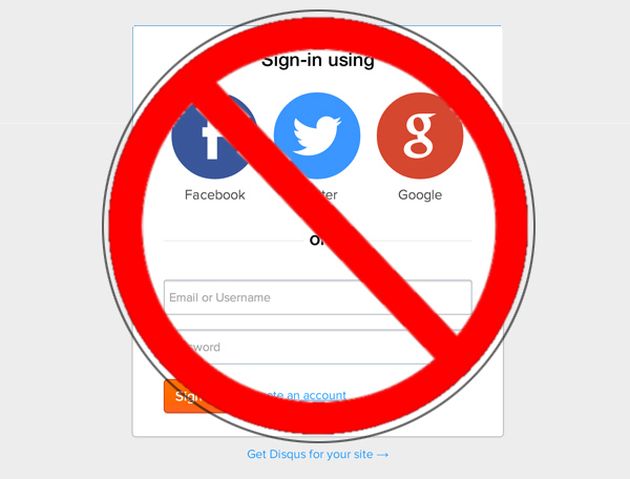
Let users make their own decision whether to sign up for your website or not. Don’t push users to register and create an account to get the access to information. Users are unlikely to provide personal data before they find out what the site is about. They would better look for the site where they can get the same information without any registration or other delays. So don’t make the website lose its visitors.
8. Poor Attention to Detail

After the website is finished, don’t publish it without testing. Any step that could be missed during development process now has to be carefully revised. It would take a lot of time and require a lot of programming to correct bugs of the website which has been already published.
9. Improper Titles

SEO optimization is a very important aspect for any website rate. Titles of every uploaded file or image should reflect the content on the page, have to be relevant and unique. Check all the titles and rename files if they are untitled.
10. Irrelevant Ads

Any web-designer should remember that advertisements shouldn’t be incorporated into the content. Place ads separately from content on the page and don’t mix them. Add links and make them relevant to the corresponding product pages. Users should easily distinguish between content and advertisement.
If you learn to avoid all of these mistakes when you create another website, you are sure to become a real web-design expert.