
5 Best Navigation Tips You Should Follow
Today it’s pretty easy to create an intuitive and user-friendly navigation structure of a website. There is a wide range of modern techniques that make navigation simpler than ever before. However, each designer should know a few important tips that are sure to help them design a perfect website which will be easy to browse for every user.
These are 5 navigation tips every designer should follow.
1. A Visitor Should Reach Their Key Aim

For instance, you’re running a fashion store, so you’ve got a number of loyal customers that visit your store on a regular basis and buy your products from time to time. Your website contains some product categories which include a list of products, some of them are popular, some are new, etc.
Every time you add new products into collections familiar to your users, they should be properly highlighted to make users understand they are new, so they are welcome to check them out. The main goal of a repeat user is to review the updates on your website, so make it easy to find those updates on your web-pages.
2. Create Roadmaps and Let a User Know Their Location
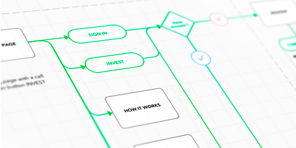
Every category on your website includes a subcategory, and a subcategory can direct to another section, for instance a product page with title, photos and description. Let’s see, you’ve got a category called Cameras and Camcorders, this category can include a subcategory called Digital Camera Accessories, and then your visitor goes to the Camera Lenses category to find a standard lens.
Prevent a visitor from getting lost in numerous categories of products on your website. The good thing here is to use breadcrumbs. In this case, your visitor will see the direction like Cameras and Camcorders -> Digital Camera Accessories -> Camera Lenses – Standard Lens Black.
This way you help your user know where they are on your website and you help them to easily come back to the initial point of departure.
Other ways of helping a user be confident about their location include sticky menus, back-to-top buttons, and more navigation elements.
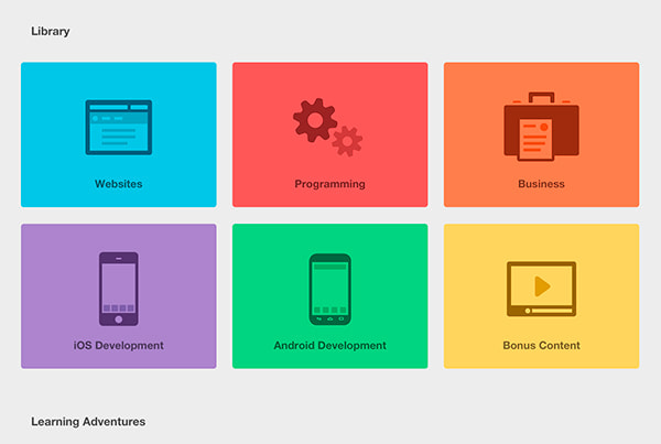
3. Use Predictable Design Elements
When designing a scheme of navigation, it is important to keep up with the consistency and standards. Icons and other site elements should be predictable, obvious and familiar to users. It’s not the place to confuse a user by making them guess the meaning of every icon.
You can make icons animated or add any creativity, but leave them easy to understand and intuitive.
4. Don’t Overwhelm a User With Menu Items
A long menu can both confuse a user and overwhelm the design. Leave only main items in your main menu and put all other ones, for instance, into the list of categories in the sidebar. Keep the minimal number of links on the homepage and other pages, this is sure to improve navigation without any clattering.
5. Build the Menu Depending On Your Content Volume
Navigation is a key of any perfect UX. If you’ve got a lot of content, then a limited amount of menu items won’t be enough for creating perfect navigation. Sometimes it is necessary to create a few menus with a definite amount of items. You can place a list of key website sections in the sidebar and in header, use drop down menus, hamburger menu in web version of your site, etc.
Conclusion:
Are there any more tips you personally use and want to share? Or maybe you’ve got some concerns, or you disagree with the mentioned above tips? Please leave your opinion in the comments. Thanks.