
7 UX Mistakes That Destroy Your Content
Informative and stunning content, appealing design and a bit of luck – are the key ingredients of success if your run a website. There are some common UX mistakes that not just ruin your design but influence your visitors’ behavior very badly.
Some of those mistakes confuse the users and prevent them from seeing the purpose of attending a web-page or make them doubt about their further actions. So let’s see what things are better to avoid when starting an online project.
1. Illegible Typography

Some modern typefaces that folks consider to be trendy are sometimes difficult to read. As we know, it’s better to use a combination of two different fonts in a single design, but not more. Choose a combination of fonts that match each other as perfectly as possible, pay attention at the the kerning and a number of characters used in the typeface, especially if you use a novelty one.
Avoid selecting the typefaces with extreme slants, tight and condensed letterforms, overly elaborate swashes, tails or ligatures, or letterforms that seem to run together or have uncommon shapes. If you use italics, tails are not recommended either.
2. Bad Alignment
Consistent alignment is what really matters. Type and elements should rest comfortably within a grid, and jagged edges should be avoided. Poor alignment disrupts the visual flow making it hard for users to move from one element to the next one. Users can get lost in the mess and might miss what is most essential when it comes to content.
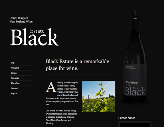
3. Inappropriate Photos

If the photos are chosen incorrectly it is sure to confuse users and create a disjointed visual connection with text. Avoid picking silly or overused stock images: If the photo doesn’t seem real or if you’ve seen it on other similar websites, it’s not your variant.
Don’t take images with low resolution or poor quality – it’s an axiom. Images should enhance content, not make it muddy, so don’t take the ones that have no relation with content.
4. Neglecting the Mobile
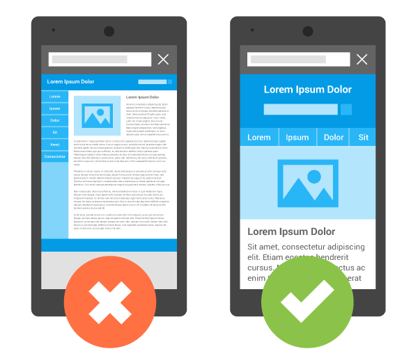
Everyone knows that modern websites should be designed on responsive frameworks but it’s not a one-stop solution. The design must be adjusted for various display sizes.
The website functions well on mobile, but the typeface size is too small or images are sized unresponsively? These little details can seriously annoy users.
5. Acid-Dip Color Scheme
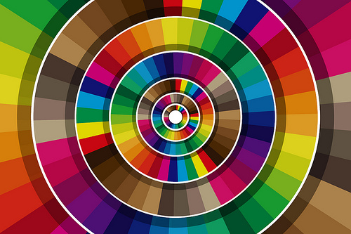
Too much color can be distracting and often has an amateurish feel. For every project that pulls off a rainbow-inspired palette, another 1,000 projects fail. Unless your brand guidelines call for using that kind of color scheme, avoid it.
6. Lack of Interactions

A good website design is a web of actions, interactions and movements that flow from page to page. The goal is to have visitors connect with as much content as possible on the path to a desired action. So the lack or absence of interactions is a fatal mistake in most of the cases.
7. Too Much of a Good Thing
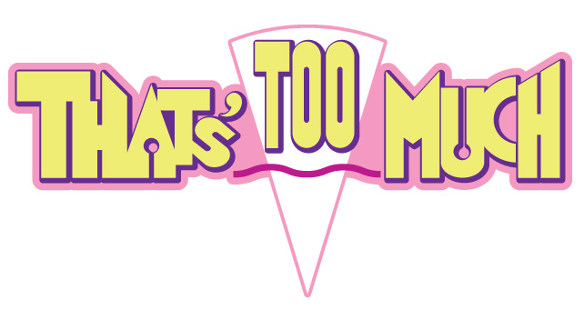
Don’t go overboard with your super-cool elements. Don’t clutter a good Illustration with lots of other illustrations that dilute the photo. The same is true with icons or any other method that’s your hook to entice users. You want to leave them wanted more, not overwhelmed by volume.
Conclusion:
Don’t be ashamed when you commit a design sin, adjust and move on.