A Deeper Look into the Google Material Design
Being firstly announced in this summer, material design is started to be used by Google in Android 5.0 “Lollipop” which is the newest version of the Android operating system. Although, Android apps are using the company’s “material design” principles as well. But still, when people hear “material design”, they are confused by this metaphor as there’s the difference between the real and digital world. So what is material design by Google? To get you more information, we structured this post into several parts, so you can get the clear idea about this topic:
What is Material Design?
Actually, a material metaphor is “the unifying theory of a rationalized space and a system of motion.“
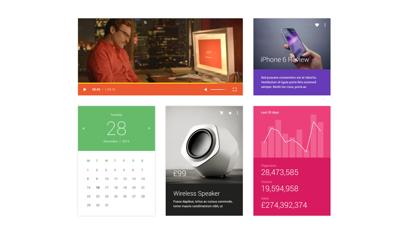
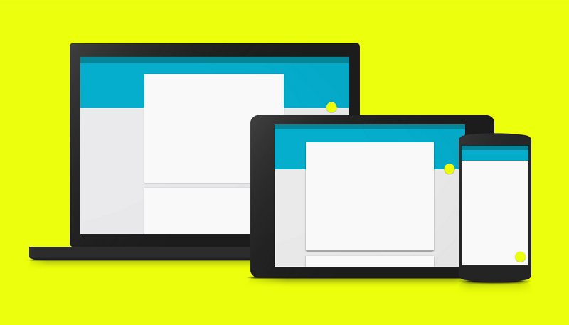
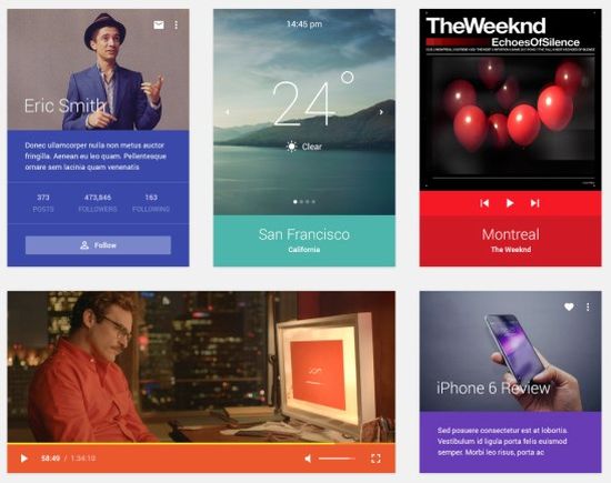
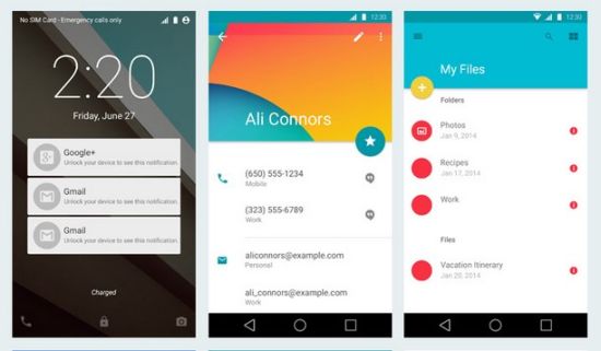
The main idea of material design is to present the new design language which allows to create the intuitive user interface that possesses bright colors, edge-to-edge imagery and large-scale typography. It also includes animations, transitions and other effects which are responsive and consistent across apps. One of the basic features is that all web design elements are arranged like real objects in the physical world, so they are presented as in material environment. Authentic motion, responsive interaction, meaningful transitions, delightful details – all elements of animation play an important part to build a smooth and pleasant experience as well as handy and functional application. Style, layout and patterns of material design perfectly emphasize this design language to give the user special feeling and explain what element can be touched and what can move.
To find out more details, you can read the free online documentation which offers practical advices and helpful suggestions about each component of material design.
Main principles
Let’s investigate the main principles which Google gives us in the purpose to understand the basics of material design:
1) Material is the metaphor
To better reflect the main idea and to draw a parallel between real physical world and web space, material design got its name. Google explains, “Surfaces and edges of the material provide visual cues that are grounded in reality. The use of familiar tactile attributes helps users quickly understand affordances. Yet the flexibility of the material creates new affordances that supercede those in the physical world, without breaking the rules of physics.”
2) Bold, graphic, intentional
In material design, all elements are grid-based, colors are bold, typography is large-scale and white space is intentional. They give not only a captivating look to the overall design, but also they create the visual hierarchy and focus. Google underlines, “An emphasis on user actions makes core functionality immediately apparent and provides waypoints for the user.”
3) Motion provides meaning
The main purpose of motion is to present objects without breaking the continuity and focus user’s attention on them: “Motion respects and reinforces the user as the prime mover. Primary user actions are inflection points that initiate motion, transforming the whole design.”
Ready-made solutions for web designers
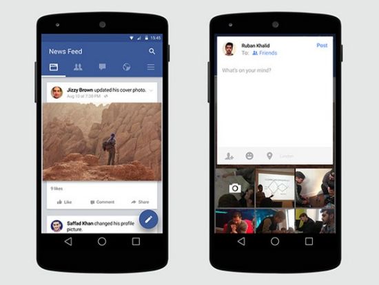
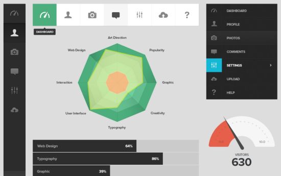
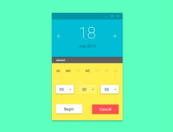
Speaking on this topic, we selected some free resources to give you more demonstrative examples of material design including system icons, psd files, UI kits and dashboard elements:
Facebook Material Design Free Psd
Android Material Design UI Kit
Digital Product and UI Design Icon Psd
Instagram UI Material Design Psd
Browsing Google Guidelines, you can download more free resources as color palettes, layout templates, Roboto & Noto fonts, sticker sheets and icons.
Future of Material Design in digital world
Taking into account that Google has never been known for its design approach, it’s quite interesting to get the new design language from this huge internet company. It will take some time to fully digest the impact of material design as everything depends from its practical usage and popularity among designers, developers and web users. Some people say that material design is just an extension of flat design and Google didn’t deliver anything special. And some people think that Google has really stepped up in its development, bringing one of the most popular trend in web design. Anyway, Google aims to “focus on the user and all else will follow” and we think it’s the top-priority target in web design.
