10 Best Practices to Design an Eye-Catching Responsive Business Website
If you run a startup or a small business, an official website of your company is a suitable investment. Some business owners would ask “Why should I build a website if I have got a page on Facebook and Twitter and a good fan base on both social networks?” Frankly speaking, any social media page is the best variant to attract target customers to the home page of your dedicated site where users can get a clear information on your nature of business and company achievements. A Facebook page is not enough to engage potential customers and “transform” them into loyal ones. So the dedicated website is a compulsory thing for the company to meet the competition.
Almost all modern sites keep updating their designs to make them easy-to-use and attractive. In this post we would like to speak about the most essential tips on creating an eye-catching corporate site for your business. These tips will be also useful if you wish to redesign the existing website or improve it for users.
1. Uniqueness and Simplicity

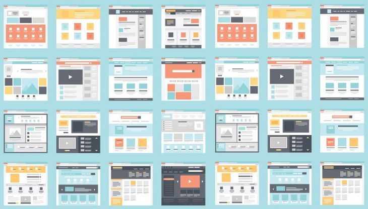
Many people consider it easy to create a website on the basis of a standard free template and make it identical to millions of other pages on the Web. Per contra, you obviously remember that a website is a reflection of your brand. So you know it has to be really unique and impressive enough to make most of the visitors remember it and want to attend it again. That is why it is always better to choose the exclusive templates developed for specific needs.
Every time you choose the design for your website, try to always stand out from the crowd offering a few unique features, for instance create an unusual style of some separate sections on the page. Don’t forget about compelling logo and original greeting.
The homepage is the first place people get into when they browse your website, that is why put here the distinct and brief information on who you are and what you do, and place here only necessary content and significant images avoiding any spare data. Remember that an excellent user experience should be a priority, that is why don’t overload your pages with heavy scripts, large images and long articles. Any page of your site should be informative, easy-to-navigate and useful for your customers.
Of course it is always better to choose responsive design, however, considering the latest versions of iOS and Windows, one can say that a flat design hasn’t lost its popularity. Flat version of design removes shadowing and gradients, makes the images smaller and more sharp, and fonts – more readable. Here are the useful tips:
- Use simple animations for quick loading.
- Think over easy navigation.
- Big fonts, more scrolling, big illustrations – are in trend of 2016.
- Use “call to action” button on the landing pages, the product pages, and other important pages of the site.
Make sure your call to action button stands out from the other content on the site. Place this button above the fold and link the page with another one where the button should lead the user.
2. Effective Presentation

When creating the product page to represent your product or service, don’t put too many products on one page and make sure you make the clear and attractive presentation. If you own the online store, make sure the pictures of every product are crisp and clear enough for a customer to want to buy what you offer. The first impression is usually gotten within a few seconds, so not only the design of your website but also the product images should be perfect.
Depending on your field, use the associated images on your web-pages, including a rotator or a slider. The relevant images can be imbedded into the background of the product page or the page where the product categories are enumerated. The rule which supposes not to overload the web-pages remains in force here. Your background images shouldn’t deflect attention from the product images. You can also feature a few product pictures on the homepage to engage more customers.
3. Fast Website Load

Your website load times play one of the key roles in building your brand’s reputation. If a site is slow, most users are going to leave it once they experience a fail. Others will probably wait a bit but won’t buy the sought-for product considering that a purchase process is a time-consuming task. A great quantity of quick and easy-to-use websites make modern users very impatient, so if your site loads slowly there is a big risk that you lose a lot of target customers from time to time.
How to improve your site load times?
- Pick quality hosts (don’t choose too cheap web hosting).
- Don’t use too much flash animations.
- Don’t use too much JS.
- Test your current page’s speed with special tools and services.
- Make sure your site loads in 1-4 seconds but not more.
4. Easy Access

When you create a site for your business, try to make it accessible for most types of users. If you make a responsible website, consider most types of displays available on the market, if your design is flat, make sure your site looks properly either on CRT, LCD, TFT or other displays. Don’t forget about the international standards when creating icons or bitmaps, and consider the needs of people with physical disabilities when choosing colors and font sizes. Also think how your site will load on devices with slower internet connection. Of course, keep the related design and navigation throughout the site. The layout of all pages should be similar.
5. Excellent User Experience

The great User Experience is provided by perfect structure of every page of the site. If the site is built properly, it is always attractive both for search engines and people. When a potential customer visits your website, they don’t read the whole text on your homepage. They pass eyes over the content, noticing the subheadings, photos and graphics, lists and videos. Only if they find what they are looking for, they may look through the entire page.
Make your pages easy to navigate through, use hyperlinks, “call to action” buttons, hamburger menu for mobile versions, and do everything possible to make a website intuitive and user-friendly.
6. Proper Content

It is a well-known fact that search engines pay attention at the content which has the SEO-friendly structure. A good SEO-text contains necessary keywords which a certain potential customer actually uses to find a product or a service through the search engine. If the keywords are coherent, they don’t look like spamming, and the text is unique, the web spider determines it as a quality one, and a website goes forward to a higher rate in the search results.
Remember that your content should be readable and interesting for people and not for the web crawlers only. Keep your content fresh and try to highlight current events, news, trends and facts which can cause interest of modern target users. If you create the advertisement, don’t make it intrusive and let your customer decide whether to buy your product after reading your advertising article or not. You should make your page attractive enough to make them read the whole content on the page.
- Use bold fonts to stress the key information.
- Use subheadings within the text to make it easier to read.
- Use lists and bullets within any single article on the page to make the key statements noticeable.
- Don’t use a lot of colorful fonts not to confuse a reader.
- Don’t put a straight text on your pages because it’s not interesting to read.
- Insert photos into every piece of text.
- Don’t forget about eye-catching headlines.
The content should be “rich” which means that a big amount of content is more likely to keep the attention of the user while a poor content may cause an attendant to leave a site. Review the sites of major competitors which have already established themselves on the market, and look at their color palette, images, navigation, and overall site layouts to get an idea on how to build a successful business website. Don’t imitate their design, try to make all your content unique and find your own “icing on the cake” to attract customers.
7. Skilled Experts

If it is pretty easy to find a good customizable ready design and make it look unique, then it is pretty tough to find a good frontend and backend developer. All scripts that allow a user interact with the site and a server interact with databases should be developed properly. If you require certain e-commerce features to be available for your site, you can choose ready ecommerce plugins for a definite platform you use.
However, if you want to develop a website from scratch, try to find a skilled expert for usability engineering, information architecture, content management system, and other important technical aspects that are critical for a successful website. When looking for an expert to cooperate with, ask them to show their prior works for you could evaluate their style and experience. Be sure to consult experts for particular questions.
8. Engaging Domain

The name of your site should tell your visitors about your occupation and it has to be easy to read, remember and pronounce. You can find a domain which complements the brand-name or get an alternative domain that contains a brand-name. Find a reliable hosting and use first-level (if possible) or second-level domains. Don’t choose the free third-level domains, they consist of several words divided by dots, and this makes them hard to spell and remember thus causing users distrust your business.
9. SEO, SEM, SMM

Search Engine Marketing as well as the Search Engine Optimization are much important either for small or large business. You can either earn or buy traffic but you can’t avoid major principles of SEO and SEM to attract more customers online which is always the opportunity to increase sales. Social Media Marketing is also a great way to get social approval, and every company is trying to be the part of issue-related online communities and engage people with related interests.
10. Responsiveness and Regular Updating

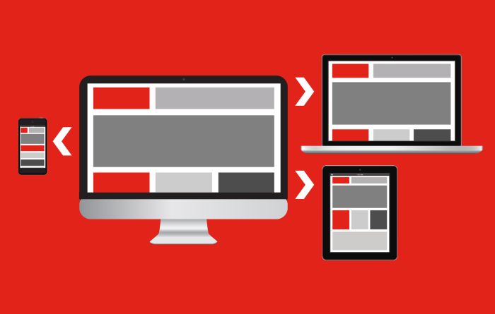
Technologies forge ahead and web-design trends evolve as well. Responsive design is a current and the most required trend today. A great percentage of traffic gotten by the websites refers to mobile devices, that is why it is much essential to make your business site easily accessible for mobile users. Responsive design is able to change depending on the screen resolution, and this is highly recommended by Google to use responsiveness while designing a SEO-optimized website.
Be sure to review modern trends and update your website design choosing the best up-to-date features. If the entire redesign is required, don’t hesitate to do it as soon as possible. Don’t forget about uniqueness which is compulsory to allow your business site stand out from the crowd.
If you can suggest any other helpful tips on how to design a great business site, you’re welcome to share your opinion in comments.
