A Design That Sticks to the Memory: Top 6 Tips
An engaging design is a goal of everyone running a website and we are sure you are no exception. Every website owner wants to have users coming back again and again, sharing their site with friends, and of course purchasing products and services they provide.
If you also wish to create a long lasting impression at your target users and make them engage with you for longer, read the following tips to find out more about the ways of creating a design that sticks to the memory.
1. Bemaze and Impress

The first impression is always important and you won’t have a second chance to produce a first impression again. Make your first visuals strong enough to catch the eye of your target users and keep them interested.
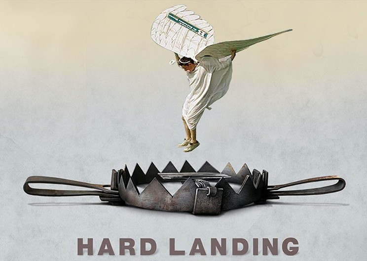
Human’s memory is the thing which is influenced by the very first action people carry out at the certain place and the last thing they do at the same place. This means that if your landing page is attractive and unusual, your first step to creating a great impression is already made.
To make your visitors remember their last actions, complement your visuals with profitable deal, special offers, a tempting opportunity to get a gift as a tenth visitor, or come up with some other encouragements to make their presence on your website memorable.
Some visual effects that will make your site stunning are:
- beautiful typography;
- contrast between elements;
- fullscreen amazing images;
- impressive video background;
and more.
2. Share Your Story

The important thing is to make people trust you, tell them why you matter, what was your start and who you are today. Every time a visitor gets on your website they want to know its purpose and find out what profit they may get if they stay with you.
Your storytelling should include strong and influential words to keep it fun to read your story. Don’t make your users be bored while reading, so don’t forget to use some exciting visuals to watch. Use long scrolling to lead your user through the story with stunning scroll patterns and visuals.
3. Be Careful with Color

A modest and minimalist design is good but it is more likely it will be forgotten very soon. If you use too much color and make your design too colorific and bright it will look irritating and a user is likely to leave your website not to come back again. It’s essential that you make your design stylish and well-balanced by mixing colors in interesting and correct proportion.
Choose a color palette that works great for your nature of business and differs from the most palettes users usually come across on other related websites. Select a right background that suits you but doesn’t distract the attention from the content.
If you nevertheless prefer a minimal style, you can use it for other pages of your website except for the homepage. So your front page will work as a trap to engage and amaze users to make them examine the content of other pages more thoroughly.
4. Make it Fun

Large amazing photos and gorgeous typography are not the only aspects keeping it fun to be present at your website. For instance, if you are offering a discount for a certain product, your landing page can include a popular Tetris game, so people will play it to win the higher percentage of discount up to 90 per cent. Depending on the score they can win 10, 15, 20, 50 and more per cent and cut the price of product as they are able to. The same idea works with other encouragements to stimulate your sales.
This type of fun will make visitors stay at your website for longer and may be they will recommend it to a friend so you get more visitors that remember your site and find it to be fun and worthy to stay at.
Other elements that will make your website fun to stay at:
- happy faces on photos and in videos;
- bright and saturated colors;
- a game to play;
- frisky language;
and more.
5. Play with Senses

Make people feel emotions while they browse the content of your website. Make your animation, images and videos look and “speak” like they are present in reality. If it’s a green tea, use slow motion or Kenburns Slider to make users feel like they smell this tea themselves, if it’s a flower make users feel like they hold it in their hands, and so on…
If you connect with users’ senses, it is more likely they find it interesting to stay at your website for longer and come back again. If you want to sell a product make it look tasty, tempting and attractive enough to make people buy it and hold it immediately and without hesitation.
Don’t forget about interaction, let users do something and get something in return so that your design looks and feels like it’s a living being.
6. Give Users a Choice

Some designers craft their websites in a way that allows to change the content or tweak the design every time a user enters a website. This opportunity provides users with new uncommon experience and encourages them to return more and more to see what’s next. If a website connects with a repeat user base new content is loaded all the time and this can be pretty tricky.
The only thing is that such changes shouldn’t confuse users and make them feel like they enter a new website instead of yours, all designs should have something in common and they should nevertheless feel like your particular content and design.
Conclusion:
When you design to stick to the memory of your users, always remember about the first and the last impressions you create – these two aspects are the most important. Address to subconsciousness of your visitors and potential customers and make them believe that your website is a worthy thing to remember and keep attending.
