An Interview with Rutger Paulusse – Typographer and Illustrator
“Do Things That Put a Smile On Your Face or Make You Dance While Working On”
Graphic design and illustration are perfect fields to express creativity and share your conceptual worldview. Typography is not only the part of design but also the kind of art that evokes emotions in the viewer. We use type to express thoughts but the style of type expresses our mood. Hand-crafted typography includes the personality of the author and becomes the significant part of evocative design.
Rutger Paulusse aka. Gwer is known as a creative illustrator, designer and typographer. He made his career in Amsterdam and New York and goes on moving towards new horizons. Well, I guess it would be much better if Rutger tells himself, just read and enjoy!
1. Will you please say a few words about yourself and your field of expertise?
“My name is Rutger Paulusse and I work as a freelance illustrator under the moniker ‘Gwer’. I’m focusing on designs for online and print, playing around with graphic shapes, bold colours, dimensions and space.”
2. What made you get interested in the art of typography?
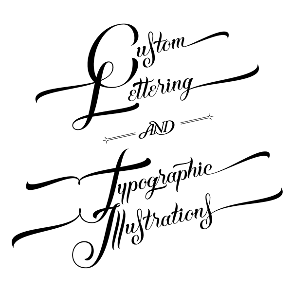
“When I was younger I got into graffiti, drawing and writing letters all day. At some point, when I was studying graphic design I found out it’s a whole genre in design. For me at that point it was the most interesting part of design. I started to get into illustrator and really learned how to draw your lettering really tight in vector.”
3. And why did you choose to focus on illustration after all?
“I was really into vector lettering, but I saw a lot of cool illustrative typography as well. I wasn’t very skilled technically, I only really knew how to use Illustrator, so I decided it was time to learn some 3D and Photoshop. Once I learned the basics my work shifted towards just illustration, but not really with a reason, it just happened. I started to get more and more illustration jobs and at some point I realised I was mostly doing that.
It doesn’t mean I don’t do typography at all anymore, I love to work on typographic pieces, but nowadays if I work on a typographic piece it’s more based on my illustrative style.”
4. Why Gwer? Will you please share the story of this interesting nickname?
“It was a nickname, all my friends called me that in high school. It was an evolution of a very sloppy and weird pronunciation of the last syllable of my name Rutger.”
5. Why did you choose New York to move to? Were there any particular challenges you had to overcome to start your life and career in New York?
“I chose New York firstly because I really wanted to travel there. At some point, when I wanted to do an internship to learn 3D and illustration, I decided I should combine these two. I wrote an email to a New York based agency and they let me do an internship. During the internship they asked me if I wanted to stay and work for them. Of course I said yes, it was a dream coming true.
Moving to a foreign country is always challenging, paperwork and visa stuff and all that. But I was in a point of my life that I could use a fresh surrounding so it was a pretty easy step. It doesn’t mean it was always easy, I sometimes really missed the comfortable way of living from my home country, and off course I missed my friends from time to time. It was all worth it though, it was one of the most amazing experiences of my life.”
6. Are there any academic degrees you are really proud of? Can you claim your expertise would have been incomplete without the education? Or maybe you have some other thoughts concerning this question?
“My education (bachelor of Graphic Design) was good to learn the basics and to be able to see all different sides of art & design. I must say though, that I learned most at my internships and personal explorations of styles and ways of working. If you have an opportunity to get educated it can be really helpful, but it’s not necessary to become a good designer or illustrator at all. Most talented designers and illustrators I know these days are self-taught and never went to art school or such.”
7. Are there any specific projects you consider to be beneficial for your career start? Do you have any awards in your field?
“I never won any awards, but I think the projects that helped me most were the projects that came out of my heart. It sounds cheesy, but really, the projects I loved doing the most and I had the most fun with, brought me the most eventually. Some self initiated pieces landed me some really cool commissions. I think having fun is the most important part.”
8. How would you describe your typography style? Will you please say a few words on your most remarkable projects? Can we see a few of them?
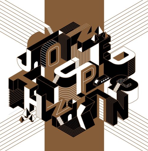
“My illustrated typography is very dimensional and bold. I like to play around with dimensions, space and a limited colour palette. The cover design for Modus was a cool type project to work on. I wasn’t doing a lot vector anymore, so it was a lot of fun. The one showing here was a dismissed version, way too difficult to read for a cover, but I prefer it above the final, just because of that weirdness.”
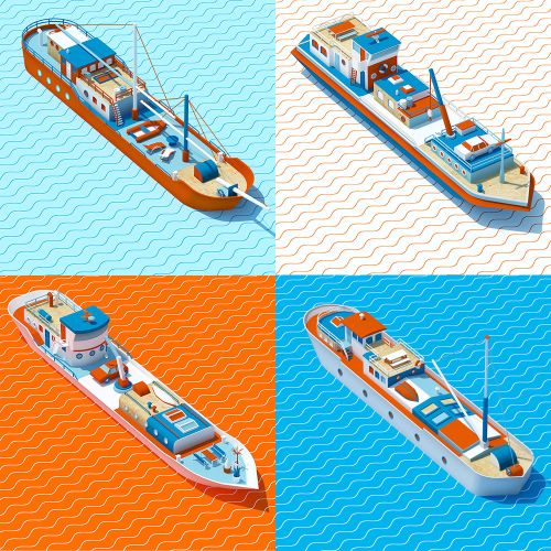
“An illustration project I really loved to work on were my Boathouses. I was fascinated by the Amsterdam boathouses for a while so it was really cool to go out and photograph some to illustrate them.”
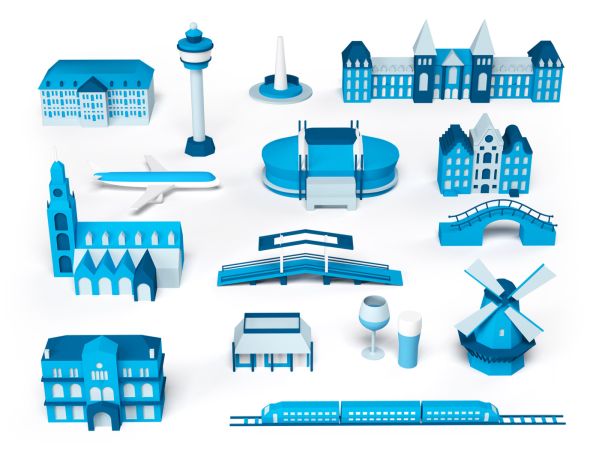
“One of the most fun commissioned jobs from last year was for KLM, an airline. I was able to make something that was completely my own style, for a really good brand.”
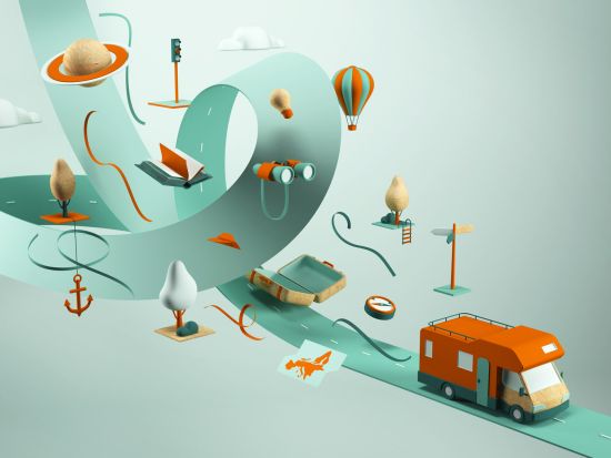
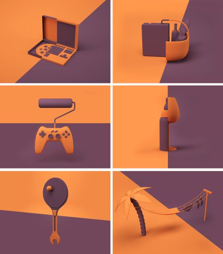
“Some other cool self initiated projects I worked own were my Camper Life piece and the Breaks series.”
9. What style of illustration you prefer?
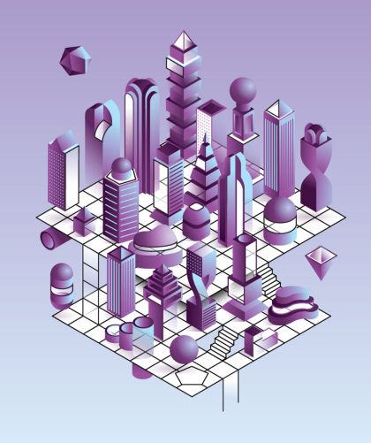
“I like the more graphic and geometric styles. I really enjoy really stylised and slick illustrations that are spacious and dimensional.
I had a lot of fun working a book cover for Flatland for Rock Paper Books. That was a really cool commission, and I really love how it came out.”
10. Will you please try to describe your vision on what direction do you think graphic design is going towards?
“I don’t really know about graphic design, but the thing that I see a lot in illustration and design are multi-disciplinary projects in which different skills get combined. Also, I see that the technical skills are getting crazier and crazier. It’s amazing for example how realistic some 3D pieces are these days. The easy access to software and tutorials is really making people push further and further technically.”
11. What advice would you give to a beginner in graphic design?
“Have fun. Only do things that put a smile on your face or make you dance while working on.”
Many thanks to Rutger for his time and such a positive and interesting conversation.
