Animated Web Design in 2015
Animation started to be integrated in websites’ design several years ago. Step by step designers added different effects in some elements. Today animation is huge: some websites are fully animated, some partially but it has reached a totally different level. Technologies allow going from mechanical to more smooth graphic moves.
Why animation? It’s interesting. No matter how old are you, you still become excited when you see a beautiful design, especially when the beauty is in motion. While content is still a number one priority, storytelling can reach a completely new level with the help of animated effects.
So, let’s say now you can either build a website that will be like 90% animated, or just have a couple of animated elements here and there. It is up to you and up to the purpose of the website. If it is a design studio, a photography website, or any entertaining portal, it can be all funky and lively. But if it is a business website, then you probably shouldn’t go crazy about the design. In 2015, however, animation is a big trend, so your clients will expect some stunts for sure.
If the website is more of a gallery, and the accent is being made on visualization, you can add as much animation as you can possibly think of. A user will simply sit back comfortably and watch. But some people really like to participate in what is going on on the screen. Here you can include the so-called scroll activated animation, when users trigger action. It becomes some sort of a game. Again, this should be applied to websites that have less written content to concentrate on.
To find the perfect combination for your project you need to a) understand the purpose; b) define the content; c) experiment. Some experts suggest sticking to the classic tools such as After Effects or Origami/Quartz Composer, but we are sure that 2015 will discover newer apps for creating the most wonderful animation.
Let’s review some of the recent examples of animated sites.
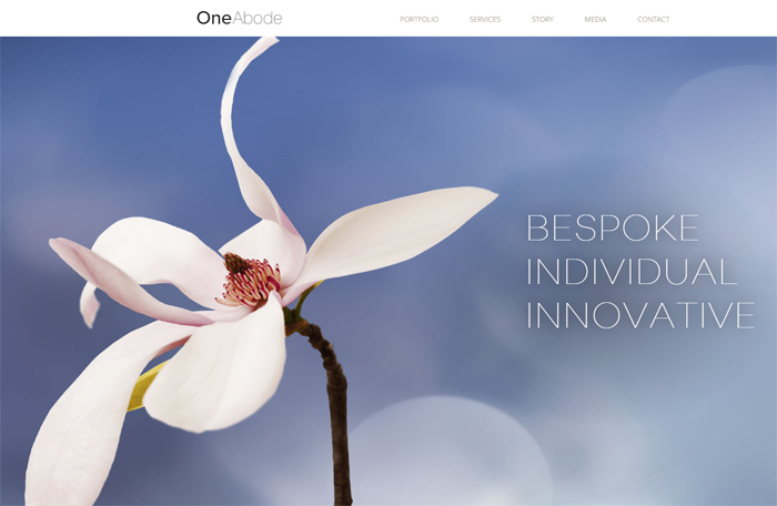
OneAbode is a landscape consultancy. On this elegant website they present the examples of the projects that their architects perform. It is a simple minimalist site with a few animated effects. Since the purpose is to display the projects, the accent is made on images instead of written content. Therefore, you can enjoy large slideshow on the home page, and in Portfolio section every category starts with a subtle motion of the main image and the title. It is elementary, and works great for the visitors.
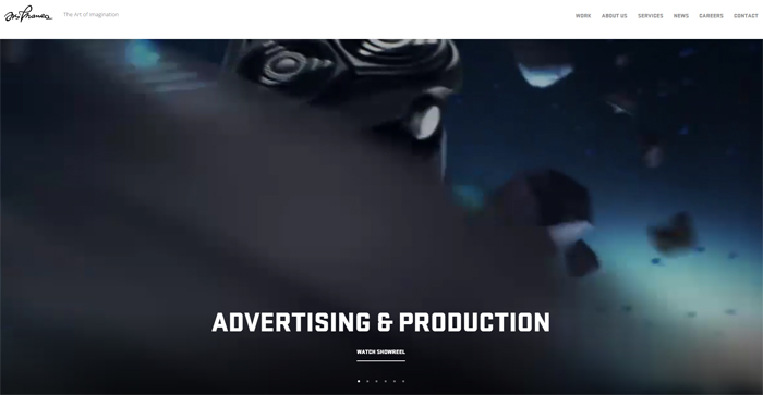
This is information and feature rich website that belongs to advertising and production agency. The front page supports widgets: you can either enjoy the animation or go with showreel. No matter which section you enter all images and notes slide at you as you scroll, and this animation effect is combined with subtle hover effects. Fun!
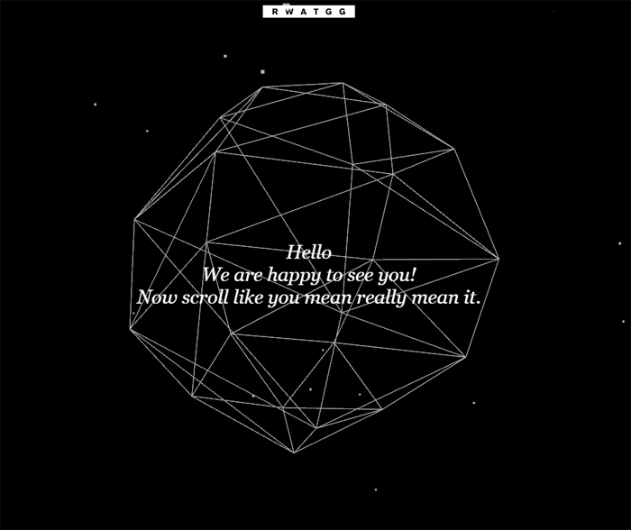
The concept is not exactly clear, and there is very little information. However, the home page looks pretty intriguing. You don’t get to trigger any action on this page, but you can see how the animation works in a pure minimalist design. On the product page they used hover effects for reviewing images. Every time you go back to the main page, it gives you an interesting fact or a humorous note right in the center of the spinning sphere.
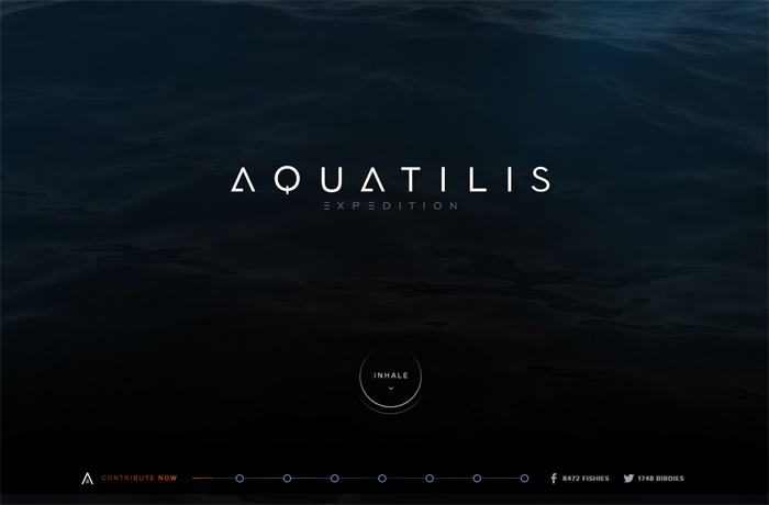
A mysterious website for mysterious ocean creatures. There could have been more visual effects though, but at the same time I can see why the designers decided against it. The point was to attract new members to join the expedition, and to provide as much information as a minimalist site can handle. A jellyfish flying across the screen would probably be distracting you from the scientific mission these guys try to carry out.
This site is a wonderful example when a visitor triggers action. Mixed is animation and subtle hover effects, creating a special atmosphere. All movements are smooth and hypnotizing, make you want to stay there just a bit longer.
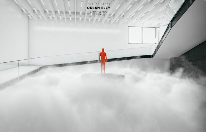
This amazing website is dedicated to the 20th anniversary of the band. When you first enter the site, you are greeted by animated intro and showreel. The designers invite you to a journey around a concert hall where you discover the information about all of the albums and interesting facts from the band’s life. You trigger action and can go back and forth around this virtual hall of fame.
Sweet design for a sweet business. The beautiful website is built based on the best traditions of minimal design, including a fully animated Home page. It reminds a little bit of a fairytale with a modern and sophisticated touch.
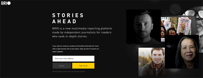
BRIO publishes narrative journalism. This is more of a business style website, with subtle but pretty involving effects. Smoothly sliding images and texts are giving aesthetic pleasure while reviewing the page. And you get to read more after subscribing.
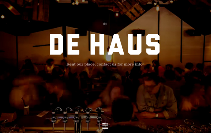
This one is probably one of my favorite websites from today’s post. De Haus is a restaurant/bar/salon. They advertise their place using stunning photos (all in the same gamma) and smooth animation effects. If you scroll you speed the process up, or you just wait for new sections to load. The home page displays a showreel, and it makes you feel like you are watching what is happening inside the bar.

Even though the Chinese New Year has passed, we still get to enjoy this awesome website. There is no information you could possibly learn. Its purpose is pure fun. They suggest you typing in a couple of words and then enjoy watching them go off like fireworks in the dark sky. This is a completely animation design for an entertaining website.

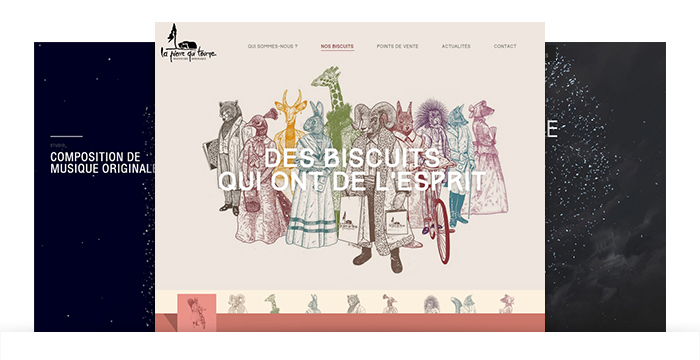
This is a wonderful scroll activated animation website that tells us the story of how lager is being made. There are no mechanical moves despite the fact that illustrations do not give you a real life feeling. The smooth parallax scrolling helps avoiding that.
Some of these examples are truly amazing animation-wise, some of them are still business-oriented. It all depends on how much animation is Okay to include, and what is its role in the project.