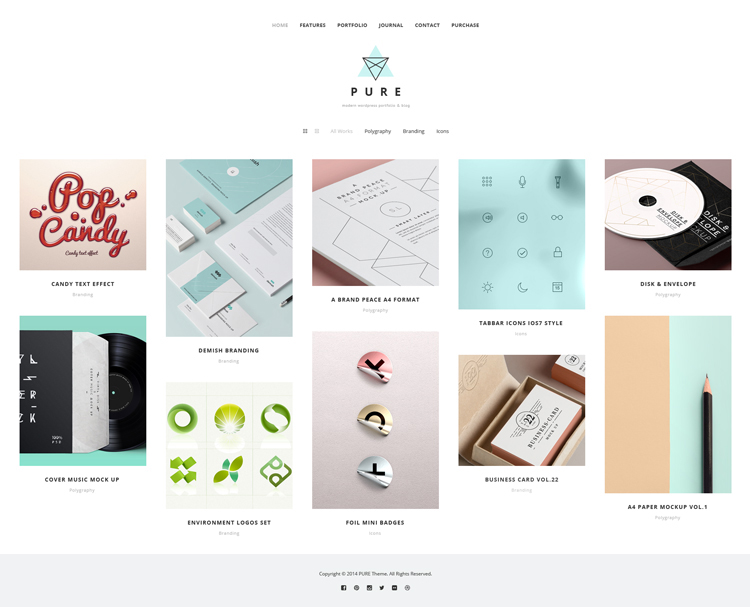
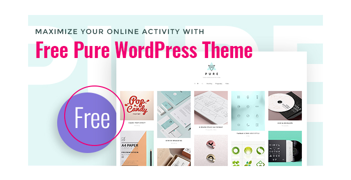
For all of you looking for a modern and stylish presentation for a website, our GT3 team has created a great new product which we would like to present you for free! It is Pure WordPress Theme that will perfectly show your project in a favorable light.
Actually, designing any website can be a complicated process: you need to choose an appropriate layout, well-balanced color scheme, an overall look and structure of your future website. That’s why our professional designers and developers want to help you and bring this ready-made solution to save your time and money. Our contemporary Pure Theme has a minimal design and pure look which will give your visitors the air to breeze, paying their attention on the content at the same time.

Running on WordPress, our Free Pure Theme has all necessary components which will give you maximum freedom while customizing it. Home, Journal, Portfolio and Contact pages will place all your data by nicely arranging it in a well-defined layout. Such necessary shortcodes as Gallery, Blog Posts, Icon Boxes, Testimonials, Promo Text and much more will assist you in implementing all your design ideas in life.
You can hardly find more suitable WordPress theme for your online project, so use your chance and View Demo!
Theme Features:
- Latest WordPress Compatibily
- Drag & Drop GT3 Page Builder
- Easy to Use and Intuitive System
- Tons of Shortcodes/Modules
- Create Different Page Layouts
- Drag & Drop Page Modules
- Custom Settings in Modules
- Time Saving System
- Fully Responsive
- Retina Ready
- HTML5 & CSS Code
- Coded with SEO in mind (Yoast and all in one SEO pack support).
- One Click Demo Import
- Custom Translator
- WPML Supported (.po, .mo files)
- Easy Color Management
- Google Font Support 600+
- Advanced Theme Settings Panel
- Different Header Layouts
- Different Taglines
- Different Page Layouts
- Custom Menu (enable/disable via admin panel)
- Custom backgrounds for modules (color, images)
- Simple Gallery (photo/video)
- Custom Modules
- Custom Shortcodes
- Custom Widgets
- Recent Post
- Flickr
- Post Formats Support (youtube and vimeo support)
- Portfolio Pages (1,2,3,4 columns)
- Non-ajax Portfolio
- Unlimited Sidebars
- Working Ajax Contact Form (spam protected)
- Mailchimp Plugin Support
- PSD Files Included
- Extended Documentation
- And much more…
Important:
Please note that the images are not included in the source zip file.


Hi!
I can not download the theme… I have introduced my email into the box but i have not recieved the link for downloading yet. Can you help me?
Thanks in advance!!
Hello!
What is your email address? We do not have any complaint about template download.
hello!! i have sent you a private repply. You can look at in your Facebook chat.
“The package could not be installed. The theme is missing the style.css stylesheet.
Theme install failed.”
Hi, I have tried to download the link a few times with different email address’, but not received the link. How can I get the download? thanks
Hi, love the theme, but can I change the slider in portfolio page into different kind of slideshow? Thank you.
It can be done only as a custom solution.
Hello! I’m using this theme and I love it. But I noticed, that there is a problem with the responsiveness on a iphone 6. Can you help me with this? How and where can i change the media queries for iphone 6? thanks a lot
Hello! We tested the theme on Iphone 6 and 6+ and do not see the issues on our demo page.
Unfortunately not in my case. i would like to have the text below the image – just like on the iphone 5 screen. what can i do?
You have to test on Iphone, not the online tools.
Of course I did! some friends with iphone 6 showed me the issue
We will pass this info to the developers.
Any news on the responsiveness on phones? Because I have a similar problem as Gabriela is having. This being on the android.
I solved the (lack of) responsivness of the site with some custom CSS. Here it is, if you care to use it:
@media screen and (min-width: 1025px) {
.container {
width: 90%;
padding: 0 5%;
}
}
@media screen and (max-width: 1024px) {
.row .span8 {
width: 100%;
height: auto;
padding-bottom: 20px;
}
.row .span4 {
width: 100%;
height: auto;
margin-left: 0;
padding: 8%;
}
.container {
width: 100%;
padding: 0;
}
}
Would love to implement this and try it out, only, my knowledge of CSS is a bit limited. Is it as simple as placing this code in the theme options section under “Any code (before )” ? Or do I need to add it to a different file?
What you do is you install this plugin: https://wordpress.org/plugins/simple-css/
Then paste the code I provided in the custom CSS editor that will show up as a sub menu of “Appearence”
Lovely, it works like a charm. At first something seemed off, you were able to scroll to the right when the window was fullscreen, but that was only when I was logged in on my wordpress, when I tested it on an incognito screen, everything worked fine. So thanks for this fix and your help of implementing it.
Great! Little edit: add .wrapper before .container on the two places the .container string is present. This will prevent the header to be affected.
Scratch what I wrote about wrapper and just add this to the css editor:
@media screen and (min-width: 569px) and (max-width: 1024px) {
header .container {
width: 90%;
}
header .row .span12 {
padding: 0 2%;
}
}
Edit: just this:
@media screen and (min-width: 569px) and (max-width: 1024px) {
header .container {
width: 90%;
}
}
Last input – use this final code:
@media screen and (min-width: 1025px) {
.home header {
width: 94%;
}
}
@media screen and (max-width: 1024px) {
.home header {
width: 97%;
}
}
@media screen and (min-width: 569px) and (max-width: 1024px) {
header .container {
width: 90%;
}
}
@media screen and (min-width: 1025px) {
.container {
width: 90%;
padding: 0 5%;
}
}
@media screen and (max-width: 1024px) {
.row .span8 {
width: 100%;
height: auto;
padding-bottom: 20px;
}
.row .span4 {
width: 100%;
height: auto;
margin-left: 0;
padding: 8%;
}
.container {
width: 100%;
padding: 0;
}
}
Last edit (lol):
replace the first two @media sections concerning .home header with this:
.home header {
width: 100%;
}
Now I’m done! Sorry for so much nonsense…
Same problem with iPhone 6 and 6plus.