Minimalist Web Design in 2015
2015 is now at full speed, and web designers definitely want to catch the rhythm to be trendy and all. Let us continue discussing the new trends so we are aware of what is going on in the world of web design.
Gone are the days where websites threw everything at once at us. The new era has come: minimal and clean, basically and essentially. Every detail is in its right place. Every detail matters, since there are very few of them.
Where does this come from, you ask? As every style ever known, minimalism has found itself many years ago in many aspects of the world’s culture: music, paintings, literature, architecture etc. What it means is actually the gist of this post.
Performing a minimal design is a challenge for many developers. We know that there should not be a lot of elements, but at the same time we wonder what is to be done with all the white space. Well, it is about removing as many details as possible, leaving only the most “vital” ones that make your website functional. No layers, no fuss about extra features. It all is being reduced to the content itself.
The appropriate here would be the term, now popular among designers, “less is more”. Using fewer elements to impress is a real art, and is basically the purpose of minimalist design.
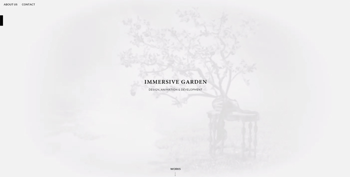
Immersive Garden is a breathtaking piece of art. With its example we are able to see what their team is concentrating on: introducing the designer projects using widgets and animation. At that the effects are subtle. Nothing screams with brightness or vividness, while the content is still powerful. Perfect concept.
It is time to focus on what matters to the users. We can forget about bright colors and rich texture, but still we want to avoid vapidity. A tasteful design is a fragile thing, though: we need to find the balance between usability, powerful content and sophisticated visualization. No worries, we are here to inspire you.
To achieve the maximum result in minimal design you have to remember to focus on one thing that your website is going to be dedicated to and go from there. See if you really need taglines or supplementary descriptions and introductions, or secondary navigation pages. Also many designers seem to stop including some of the major sections such as “Introduction”, “About”, or “Services” (unless they are vital for the business). Sometimes even social icons are removed from main pages to, let’s say, Contact section of sites. These tricks allow visitors to concentrate on the content displayed on the home page, enjoy images or read a short note.
Now, the other 2 things that we should mention are wireframe and white space.
- Wireframe is a pretty important element. A truly unique wireframe can help you to achieve the most pleasant effect. To make it happen you need to decide what, in terms of content, is the priority, and simply make the emphasis. Designers recommend using Moqups, Balsamiq, or UXpin.
- White space is practically the number one attribute of minimal web design. It used to be perceived as awkward, unpleasant, but in minimalism it is welcome.
Excellent example of white space application. The large slideshow takes the entire screen, making us study what is being displayed. This method is ideal for promotions or advertisements.
It is worth saying that any color in the palette can be used for creating a minimalist website. However, many designers tend to go for grey, white and black color schemes.
Since there are few elements, color becomes more significant. You have to be careful selecting the right shades, because there is a meaning to them too.
To sum it all up, I would like to show you guys some of the most beautiful minimalist sites. You will see what the information you’ve just read looks like when externalized. Enjoy!
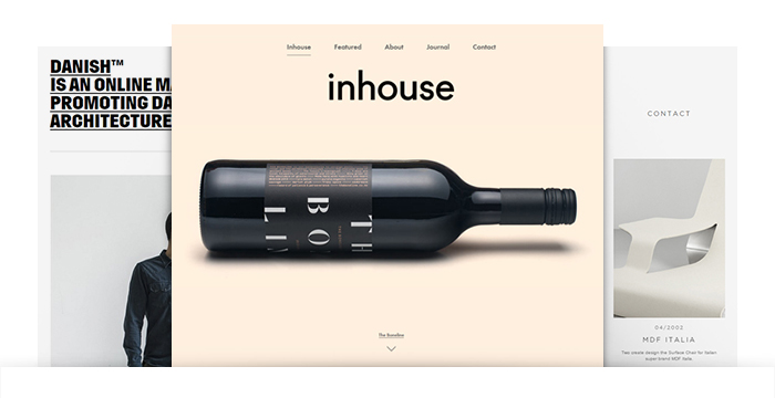
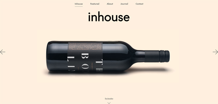
This is a design studio where you can see the examples of different types of work. There is nothing extra, every element is the right place, including the simple typography which does not distract from reviewing. And subtle hover effects add some fun during the process.
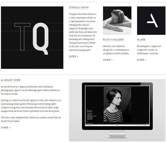
Black and white, with a slight touch of grey, Temple is a mysterious and at the same time inelaborate website. And this is the zest of the design. You can see how the wireframe works for this site. On the outside it is not 100% symmetric: the images do not all line up making the layout more interesting.
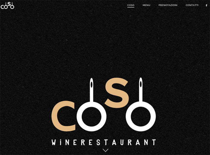
Large images, a lot of white space, carefully chosen color schemes make this website look sophisticated and user friendly. It has all the information about the restaurant, but at the same time it does not overwhelm you. Different types of fonts make the journey through the site more exciting, and beautiful gallery makes you buy a ticket to Rome. Delicious!
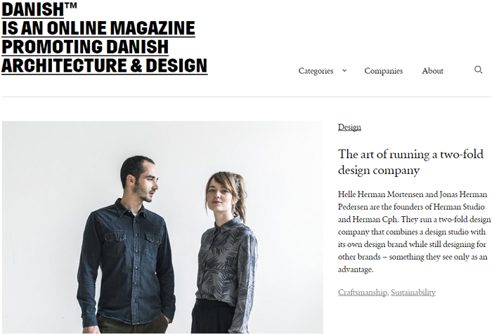
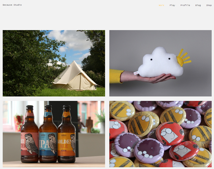
Beautiful website for beautiful pieces of design. Simple, with a bit of animation here and there, this website reminds of a more expanded version of a blog. This is convenient due to a large amount of information that the world simply has to know about. You can find articles dedicated to different types of works, review the images and download the content all in one place.
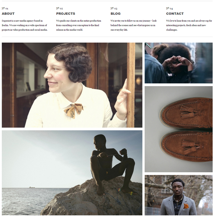
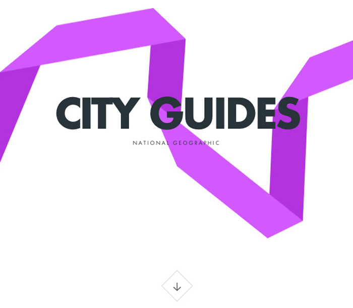
Now, here we have another masterpiece of a minimal web design. Instead of large background images you will find a card-based home page. The shortcuts are leading us to pages with different projects, playing a video presentation of each. Simpler and smaller typography does not interfere with watching videos; plus you have probably noticed that there are no social icons jumping here and there. Those were replaced by links hidden behind bold fonts at the very bottom of the site. We clearly see the point of this design, the priority that it was based on.
Rally Interactive is a hi-tech, stylish and modern website. The accent is being made on the informational content with the help of smartly chosen typography and animation. Large fonts attract your attention where there are no images or videos. The white space is carefully complemented but colorful graphics not to protrude above and beyond.
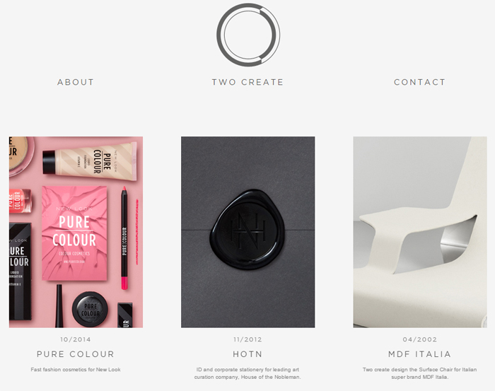
Another great example of a minimalist website: smooth color schemes, simple typography, card-based design. Social icons were moved to the Contact section to keep it elegant and simple. The ideal minimum of information creates a special atmosphere around the site.
The last example is this beautiful website with a bit more color than the previous sites, but see how harmonic it is combined with the images and hover effects. The minimalist tendencies are present in every detail of the design, emphasizing the elements when and where necessary.
These were just a few of the many minimalist sites. Each and every example makes us look at the web design principles in a new way. Your imagination is a treasure that gives the most amazing results, so do not be afraid to experiment. And stay tuned!