Modern Website Background Ideas for 2017
The newest trends lay down the law of forming the look and feel of your website in 2017. As the year starts, it’s the very time to refresh the design of your website and provide it with a new up-to-date background. Let’s see what colors, tones, patterns, and other elements will look great and suitable this year.
1. Geometry
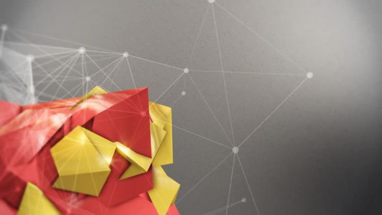
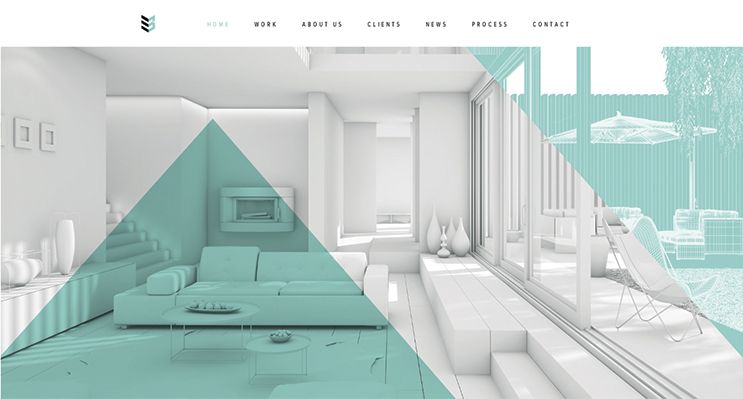
Everything from swirls to rectangles is in trend today. Full width photos with elements that feel like tactile and are designed with more basic shapes than usual will also look awesome. Geometric elements should be used to draw the eye of the visitor to the definite part of the photo or lead them to a specific action. Shapes can also be used to help emphasize brand identity or create a stronger connection.
2. Gray Shades
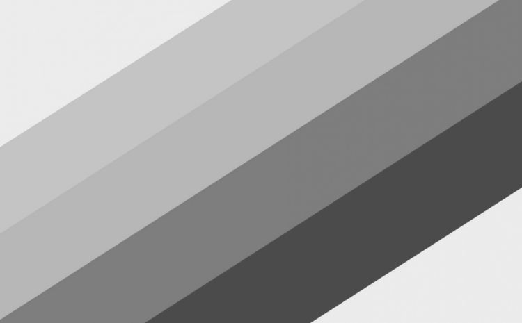
No need to leave a barren and white background today, ‘cause it would be great to add a little gray tone to create a minimal style of a website especially if it is made with completely minimal design patterns. The amazing thing about gray backgrounds is that the color can be warmer or cooler in feel. Whatever gray variation you select, keep in mind that the elements around it will shape how the color feels to users.
3. Colorful Layers
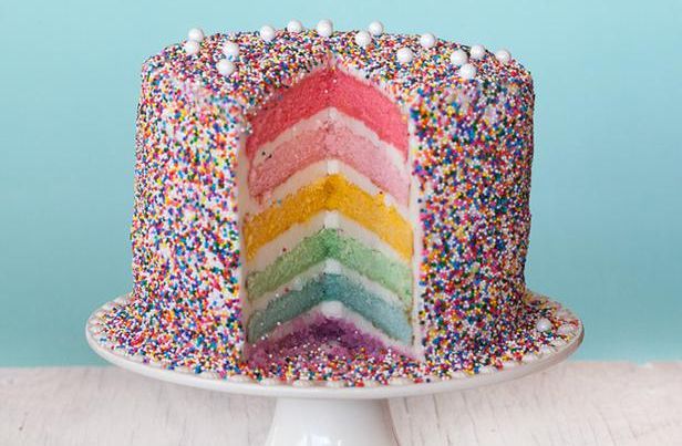
While minimalism is still in, the lack of color is not. Bright color choices are bold and exciting variants that can create the effect of a layered background. Colors add more visual interest to spaces that lack photos or other visual elements. They also draw users into the design and impress them.
4. Dissymmetry
Masonry is more in trend than grid today. A background shouldn’t be created with tiny elements or patterns that line up perfect. It doesn’t have to be a solid color or image. It’s better to prefer a combination of these elements, positioned in a way to create perfect balance that you can’t cut right down the middle.
5. Abstract Art

Combine colors, shapes and swashes for a fun visual that might not look like anything at all – this is the abstract art itself. Give your visitors something special to look at, pair it with irresistible text that makes them want to engage with the design, and you’ll be perfect.
Conclusion:
Revamp your website today to make it look modern and inspiring.
