Swiss Style in Motion: Animation in International Typographic Style
All fresh ideas are sometimes appear to be the reconsidered old ones. This phenomenon refers to fashion industry, photography, writing styles, and many other fields. Web-design is the field we are really curious about. In particular, this post is about the iconic Swiss design style which has been recreated in a modern way.
The Origin and Principles of the Swiss Style
The International Typographic Style, which is also called the Swiss Style, was built up by designers from Switzerland in the middle of the 20th century. As the country remained neutral after the Second World War, it managed to benefit from pure, highly focused and isolated designs which weren’t affected by any foreign trends. The result of this insular period was an absolutely rational and coherent grids still employed by designers today.
International Typographic style was created as a static one and was used for posters, magazines, book covers, and various pamphlets. Key principles of the Swiss Style are such as:
- color combinations;
- bold typography;
- abstract geometric patterns;
- asymmetrical layouts;
- unadorned content presentation;
- sans-serif type;
- photography over illustration;
and some others.
The Swiss designing style was popular till the late 60’s but the most impressive fact is that it is now used almost everywhere starting from iOS and ending in Material Design. Despite of the fact that this style has never been meant to be animated, its principles perfectly work in digital motion.
Animated Posters by Jon Yablonski
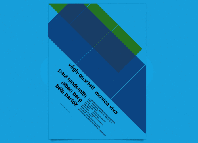
A certain Detroit-based designer Jon Yablonski decided to recreate the classic Swiss Style in CSS and vanilla Javascript. He took the static works of famous international style designers like Armin Hoffmann, Hans Neuberg, Muller-Brockman, Pierre Keller, and others ranging from the 50’s to the 70’s. His striking works showed what these famous designers would have been doing if they had been creating their designs in the age of iPhone. When looking at these works by Yablonski, one can say that it is amazing how easily and effortlessly they have come to life as if they have been initially designed to be animated.
The eight minimalist posters made by Yablonski are looking like screens of modern apps. They prove the statement that classic principles of popular graphic design are eternal and they always move ahead of their time.
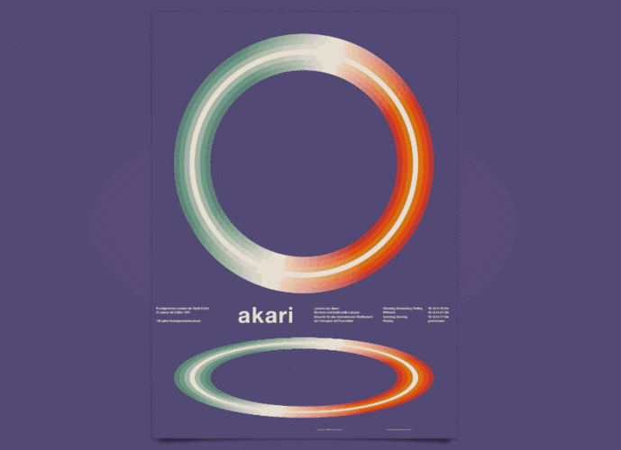
The good example is the Akari poster authored by Brockmann and transformed into a colorific swirling ring.
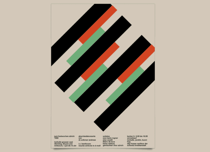
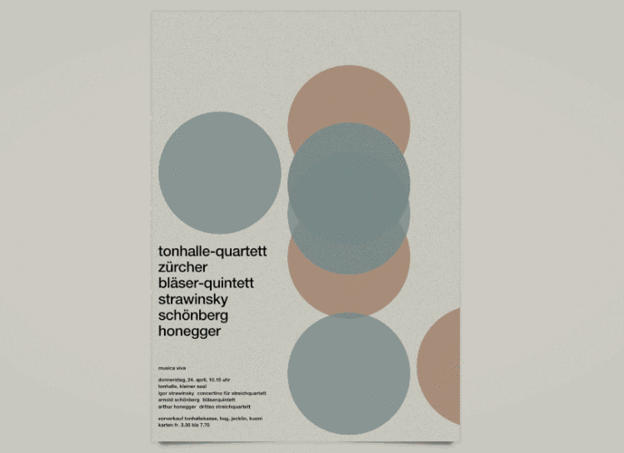
Another work, initially designed for Zurich Tonhalle in 1955, becomes an abstract crossroad made of vector polygons.

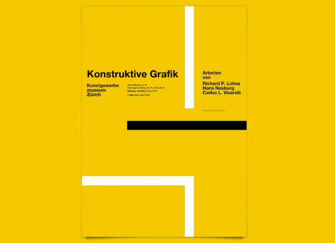
The Konstruktive Grafik poster designed in 1958, now looks like the work of an American graphic designer Soul Bass which is mostly known as a professional in creating a motion picture.
Jon Yablonski says that to design the animated poster it is better to break it into little parts, create the layers step by step and experiment with various keyframe animations, duration, and other functions.
The designer not only reproduced the minimalist Swiss Style in motion but also managed to emphasize its extraordinary complexity which reflects the inventive origin of graphic design.
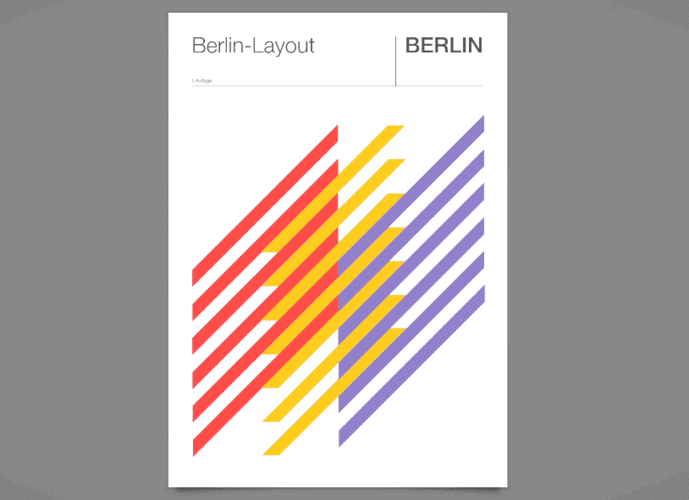
See the examples: