The Newest Design Trends to Follow or Be Careful About Using
Website design is one of the key aspects which defines how users perceive a site, and it is something that makes users decide whether to stay on a web-page or leave it forever. Most of the websites created during the last 2 years strive to become “mobile friendly” to be easily observed through various modern gadgets. Except for this major feature, there are website design trends that modern design experts suggest either to follow or think twice before following.
Considering the users’ expectations, one can say it is better to pay specific attention at user experience and important data, and it is useless to insert all types of whistles and bells sometimes considered to be fashionable. We will talk of both the acceptable and unacceptable features which are mostly used today for designing contemporary websites.
The Best Design Trends to Follow in 2015-2016
1. Responsiveness
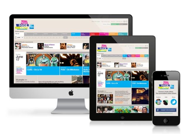
The “all-absorbing” flexibility has already captured the web design niche for a long time ago. Its twin-sister named responsiveness is the essential feature to be available for every modern and user-friendly website. Responsive design allows to build a fully-functional and mobile-ready site which can be browsed either through a stationary PC or a laptop and through a mobile phone or a tablet.
2. The Expansion of UI and UX Patterns
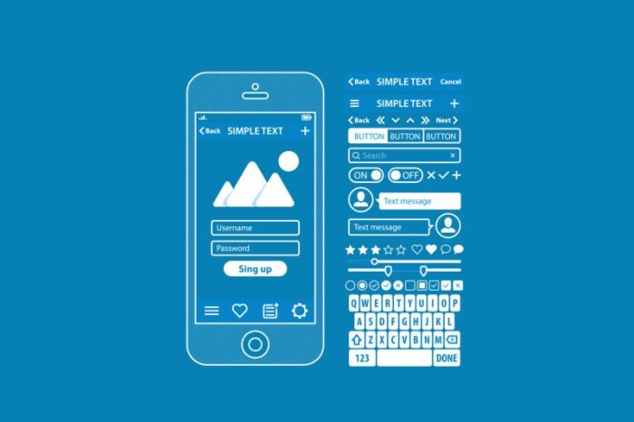
There are modern User Interface and User Experience patterns which are used for designing responsive websites for contemporary users. These patterns provide common language between web-designers and solve common design problems. The UI patterns include such solutions as a Dashboard, an Action Bar, Quick Actions, and so on, the UX ones, in their turn, include an Invitation, a Sign Up function, a First Run and Deepening Engagement, etc. Both UI and UX reach almost the same aim of providing the exceptional Web usability. These patterns are developed for Android and iOS applications and websites, so today it is impossible to imagine the Web without them.
3. Rich Animations
Different types of animations serve both a functional and emotional purpose. If animations are applied correctly, they are sure to increase user’s delight and make an interface easier to use. Large scale animations include such effects as pop-ups and parallax scrolling. These elements are used as primary interaction tools and depend on user support. Small scale animations include hover tools, spinners and loading bars and don’t need any user support. The most widespread animation techniques include navigation and menus; hover, loading, motion and background animations; scrolling; galleries and sliders.
If you tend to use animations, don’t forget that they shouldn’t affect performance of a website. Use parallax scrolling for one-page websites and avoid embedding text into graphics to leave it accessible for the search engines.
4. Microinteractions

Every web-site design or mobile app has elements that a user has to interact with. Every time a user changes a setting, picks a password, syncs their data or devices, they are engaging with a microinteraction. This thing leads users to a path of a human-oriented design which is a key to usability and responsiveness.
5. Material Design
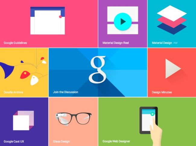
Material design is a visual language by Google which combines classic techniques of good design with innovative technology. It uses shadow effects together with concepts of motion and depth in order to create realistic designs for a user.
Except for the most useful modern trends, there are less useful features that are also commonly used today but would be better used just in particular cases.
The Most Common Trends That You Should Think Twice Before Using
There is a great rule that every web-design expert would better follow every time he or she starts to create a site, and this rule sounds like “the decision on what to design shouldn’t depend on what the coolest sites are doing”. The only things which should be taken into account before making a site are the user’s needs and expectations. Every time you start to think over a website’s appearance, don’t forget about personal approach and consider the customer’s needs.
So let’s see what trends are common today and should be used only in particular cases.
1. Hamburger Menu for Hiding Everything
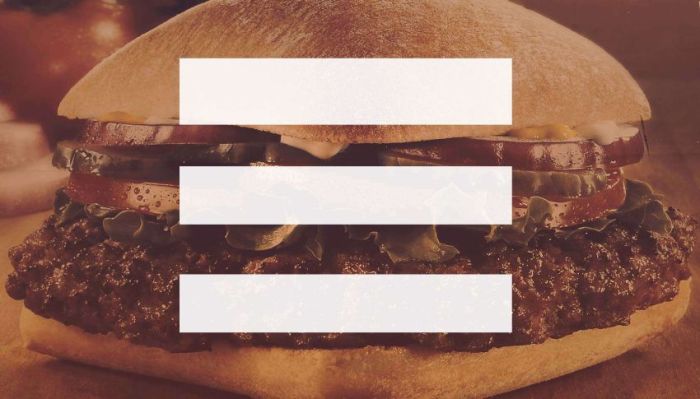
Burger Menu is a very recognizable navicon which is present on almost every responsive website. This menu looks like three parallel horizontal lines located in the header and “plays the role” of a clickable button which allows to open all the categories of the site. The button is convenient and intuitive enough for those who want to find everything they need with a single click. However, if a hamburger menu is useful for a mobile version, it won’t be good enough for a desktop one.
Some experts state that a “hamburger” which hides all the categories under one button will reduce discoverability of topics and items. Discoverability is much required for news and e-commerce websites to show the variety of news or products. Visible categories help the user to quickly understand what the site is about, while forcing users to click the hamburger menu button can cause unnecessary irritation.
Use the Hamburger for:
- Corporate sites
- Business cards
- Information portals
- Single-page websites
2. Front-Page Carousels
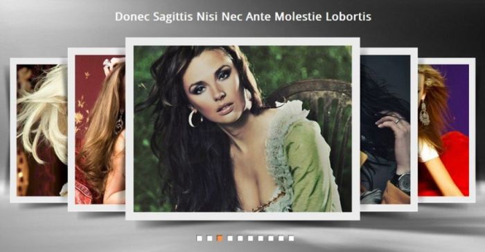
Carousels are used almost everywhere for modern websites. They keep photos and text information in order and allow to add visual interest. If a carousel is used very often, the sites look very identical and there is less difference between them. SEO experts insist that a carousel is bad for search engine optimization, because it lacks content and it prevents to get enough meta information into a page.
High-resolution pictures included into a carousel gallery are not only under-optimized ones but they also slow down the front-page which is always better to load as fast as possible.
It is not as important for a content to be located above the fold, but Google still doesn’t recommend to put the content lower down the page. A carousel element pushes the content below the fold and this is one more thing which affects the usability.
If your client likes the carousel, of course you should use it, but this feature will work at its best only if:
- You craft it carefully;
- You optimize it;
- You make sure it “complies” the User Experience and doesn’t compromise the accessibility.
3. Flash Animated Load Screens

Every time a user enters a site no one wants to be greeted with a complex load screen which they can’t remove being forced to sit through. If there is a flash animated video which lasts for more than 10 seconds and prevents the user to find out what the site is about, they are sure to leave this site forever. Another type of load screen is when there is a counter climbing to 100 percent. This counter is usually located in the center of the screen and compels the user to wait until the website loads. If you nevertheless would like to use a load screen:
- Don’t make it dull and don’t make it too “heavy” to affect performance.
- Make your load screen interactive (e.g., let the user play with the screen by moving its elements with a mouse).
- Make your screen fun to look at, using interesting graphics and music.
- Leave the navigation options clear.
- The important task is to make your screen load in 5-10 seconds, but not more.
4. A Lot of Javascript

Javascript is a highly functional language that can perform many complicated tasks which other languages can’t. It can help create sliders, interactive forms, load screens, and other elements of the website. Despite of all the advantages, Javascript can affect the performance resulting in slow load speeds and worse user experience. The most common problems which can appear due to using too much Javascript are such as:
- Inconvenient mobile browsing
- Bad functionality and bugs
- Risk of malicious code injections
- Bad SEO and lower website ranking
There is nothing wrong with using Javascript if your client likes it, but it would be better to reduce its amount on your site to make sure it is good enough to view through a mobile device.
5. Multiple Font Styles
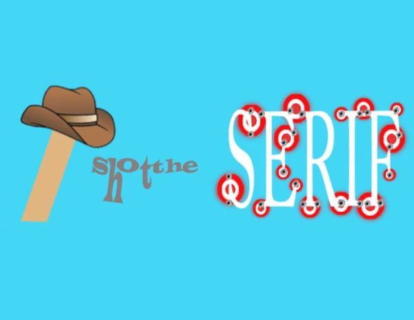
It is not recommended to use more than two font styles for a website. Despite of the fact that a lot of different typefaces would be really confusing, they also can make the website look cluttered and messy. However, if you want to use more than two fonts, choose the ones from the same family and don’t place them on the home page altogether. In this case, they will look quite readable.
If you plan to use multiple fonts, then the next tips will be useful for you:
- Try to use fonts which reflect the visual style of the certain brand.
- Use the typefaces which complement each other but are different enough to create interesting contrast.
- Emotions and associations are tied to fonts as well as to colors. So serif can be associated with formality, sans-serif feels like something reliable and worth trusting, etc.
The most fascinating trends have appeared as the finest practices in recent years. Responsive design allows the experts feel confident as for designing for a great variety of new devices which emerge almost every week. Every new trend has to be conceived critically before following the crowd. Explain the customer all pros and cons of a certain trend to help them decide what they want to see as a result. Don’t forget about minimalism which is the key “feature” of a clean, fast and user-friendly website.