The Principles of Accessible Design: Craft for the Disabled
It goes without saying that a multi-goal designer would be much-in demand for many kinds of customers including website owners, business owners, bloggers, and more. Even if you are an experienced and talented sector-specific expert, it is always better that you take your bearings in other fields of design being popular in a current time.
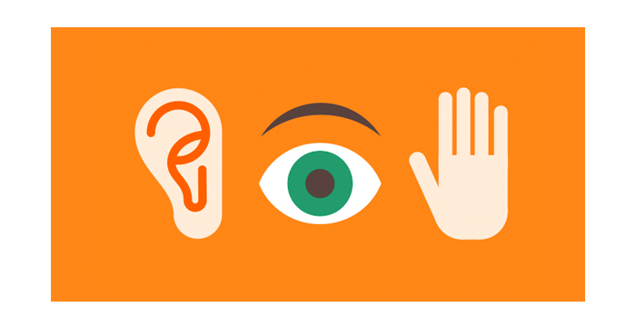
A multi-goal design is not only about UX, UI, web or graphic, and this is obvious. An ubiquitous expert should create designs for all categories of people, and people with disabilities are no exception. Accessibility is one of the most important demands for user friendliness, and we’ve decided to speak on the most essential principles on creating accessible design.
Karwai Pun – an interaction designer at Home Office Digital, has created a series of posters depicting the dos and don’ts on crafting a generally accessible and clear design. Everything, from the color choice to your website’s layout, really matters, so let us describe and interpret the ideas of Pun here in our blog.
Designing for People with Autistic Disorders

People with autism spectrum disorders aren’t able to perceive the reality as healthy ones, but if treated right, they make progress and gradually improve their quality of leaving.
When creating clear designs for such type of the disabled, one should consider the following peculiarities:
- social deficits;
- language impairment;
- repetitive behaviors;
- inability to concentrate;
- intellectual disability.
So what should a design for an autist look like?
1. Colors: use simple and ordinary colors (no halftones, no mixed colors, no bright or contrasting colors).
2. Language: use plain speech (no metaphors, hints, figures of speech, idioms or any literary devices).
3. Content Arrangement: use simple sentences and bullets (no egregious walls of text).
4. UI Elements: make descriptive buttons (no vague and confusing ones).
5. Layouts: build intuitive, easy-to-use and consistent layouts (no complex or cluttered ones).
Our note: As you see, simplicity is the key point in such kind of approach when you start designing for accessibility.
Designing for the Deaf or Hard of Hearing
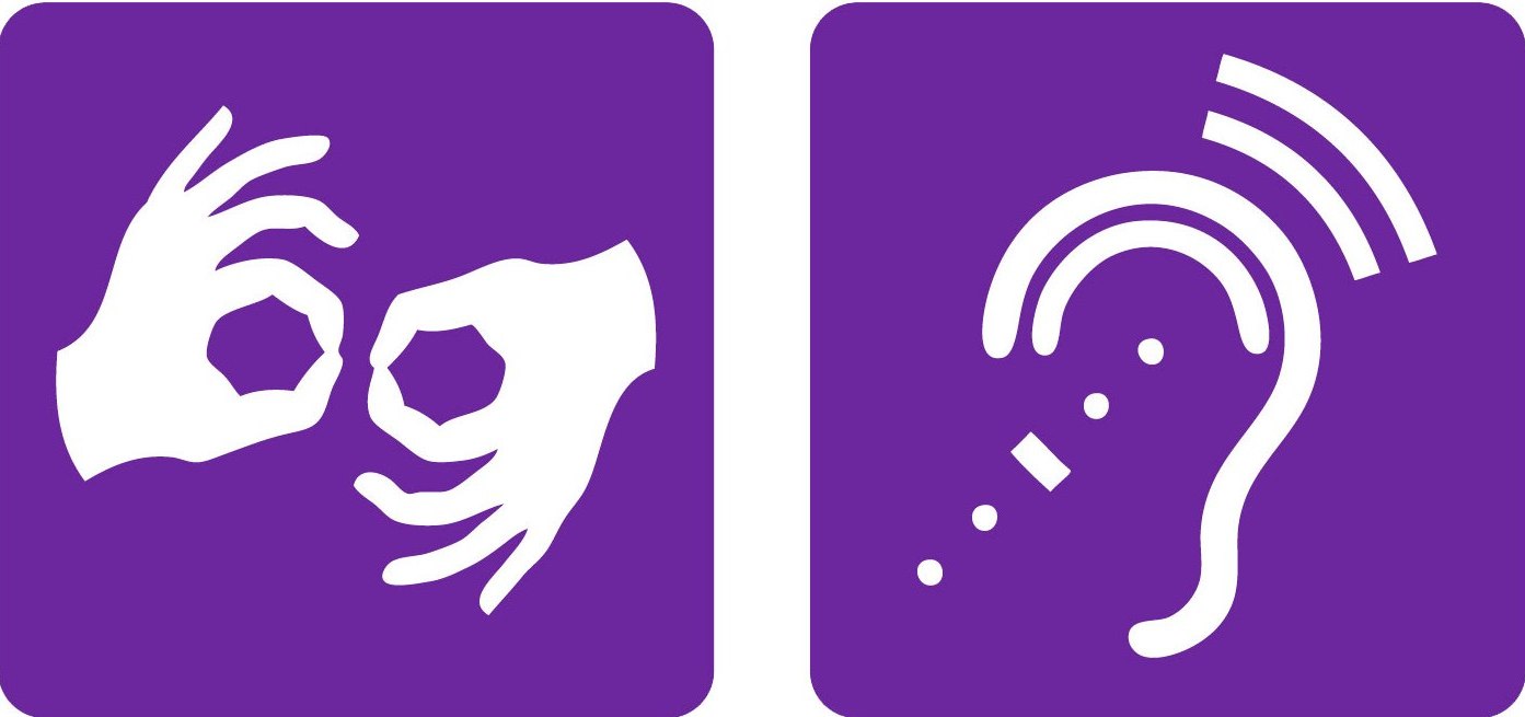
It is sometimes impossible to imagine a full-fledged website without video or audio content, and when you design for the web, you consider this type of media to be important and even compulsory. But how should a real expert act when it comes to designing for the hard of hearing?
Their symptoms are as follows:
- require frequent repetition;
- difficulty following conversations;
- difficulty hearing in noisy situations;
- difficulty hearing consonants;
- ringing in the ears;
- trouble hearing children and women (high-pitched sounds).
What is the right design for the deaf?
1. Language: use plain speech (no complicated words or figures of speech).
2. Media: always use captions, provide transcripts for videos (no audio or video without subtitles).
3. Content Arrangement: sub-headings, bullet points, images, and other “break ups” should be used in your texts (no long blocks of content or plain texts).
4. Keeping in Touch: users should be able to ask for an interpreter when booking appointments (telephone number shouldn’t be the only contact for users).
5. Layout: use a linear logical layout (no complex layouts and menus should be used).
Our note: If people are deaf from the birth, many notions and phenomena are left out of understanding (bird singing, sound of someone’s voice, noise and vibration of motor, and more) but if people lose hearing during their life, it doesn’t dramatically affect their consciousness. So if you think of names for menus, buttons, and the overall language you speak with a user, there should be something clear for the deaf but not too plain or elementary.
Designing for People with Dyslexia

Have you heard of dyslexia? The fact is that people with such disorders are of more frequent occurrence than we could ever imagine. Such people aren’t able to properly read and write though they have a usual learning capacity. Such people visit sites and even use applications, so the ability to design for such type of the disabled is highly sought.
The symptoms of dyslexia are as follows:
- speech and pronunciation problems (unable to pronounce long words);
- delayed speech development;
- problems expressing themselves;
- little understanding of rhyming words;
- difficulty with learning letters.
So what’s the design for people with dyslexia?
1. Colors and Data: let users change the contrast between background and text (don’t put too many information in one place not to make it merge).
2. Content Arrangement: use photos, images, diagrams, and other elements to support and break up texts (no large blocks of heavy text).
3. Content Quality: keep it simple, short and clear (no long words or complicated phrases, don’t rely on accurate spelling and don’t use any autocorrects).
4. Media: it’s better to produce materials in audio or video format (texts are harder to perceive; don’t force users remember information from previous pages without prompts and reminders).
5. Layout: align text to the left and keep your layout consistent (no italics, no capitals or underlined words).
Our note: Such designs are pretty easy to create, cause they should be simple and intuitive. No complex elements, complicated texts or phrases are required to be used here.
Designing for People with Low Vision
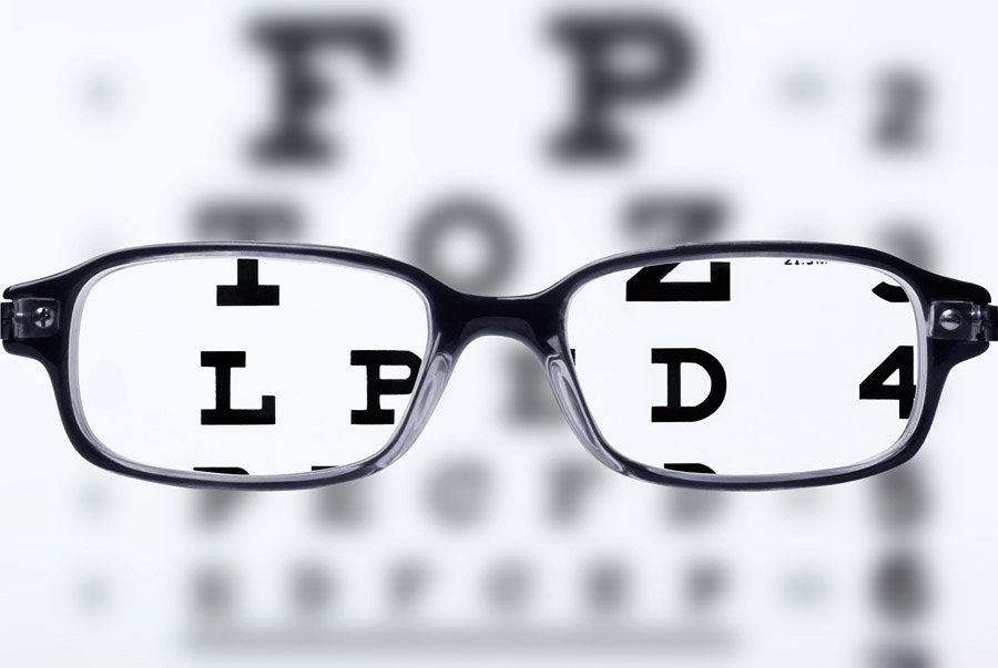
People with low vision are of a very frequent occurrence today, and this is understandable. Information is accessible and it is impossible to live a single day without reading or watching something. People spend too much time staring at the screens of their devices, and sometimes this takes all of their time. Despite of that fact, there are many people blind from the birth or their low vision is unable to cure.
The symptoms of low vision are as follows:
- difficulty recognizing objects at a distance or difficulty seeing well up close;
- difficulty differentiating colors.
The design for people with low vision is not that tough to create!
1. Colors and Fonts: use good color contrast and readable font size (no blurred letters, low color contrasts, plain colors or tiny fonts).
2. Content Arrangement: publish all information on web-pages (don’t bury any data in downloads).
3. Content Quality: use combination of color, shapes and text (don’t use color to convey meaning).
4. UI Elements: put buttons and notifications in context (don’t separate actions from their context).
5. Layout: follow a linear logical layout (don’t spread content all over the page).
Our note: designing for people with low vision is a useful skill today ’cause this type of design is one of the most popular ones when it comes to crafting for the disabled.
Designing for People with Physical or Motor Disabilities
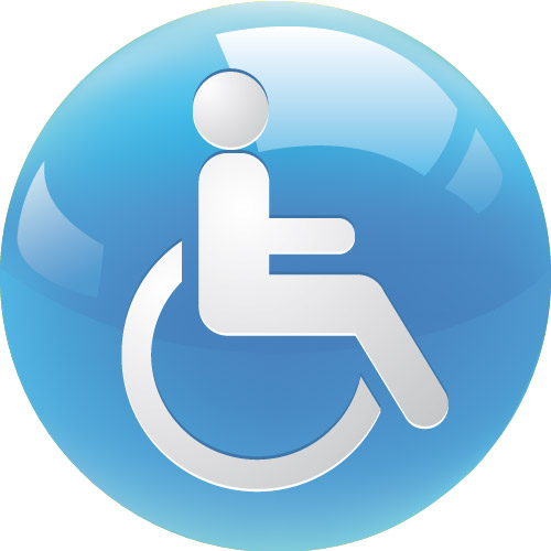
Motor skills disorder is not as rarely met as it may seem. People with such disabilities aren’t able to move without external assistance or it is difficult for them to move and walk without additional efforts.
The symptoms of such disorders are as follows:
- difficulty dancing, doing gymnastics, running;
- difficulty catching or throwing a ball with accuracy;
- difficulty producing fluent legible handwriting;
and more.
Design for people with physical or motor disabilities will be good if you follow some specific rules.
1. UI Elements: make large clickable CTA buttons (no precision demand is required).
2. Content Arrangement: give form fields space (don’t bind interactions together).
3. Structure: design for keyboard or speech only use (don’t create dynamic content that requires a lot of mouse movements).
4. Mobile: design with touchscreens in mind, buttons should be both easy to tap and click (also don’t create short time out windows, ’cause people should have time to understand what they should do before the session is timed out).
5. Keeping in Touch: provide shortcuts to make it easy to fill out a contact form and reach menu options (no need for many fields to fill out and tire users with lots of typing and scrolling).
Our note: Designing for mobile is a compulsory condition for all modern designs even if you craft them for ordinary users without any disabilities.
Designing for Users of Screen Readers

Blind or visually impaired people are the users of screen readers allowing them to perceive content without reading it from the display. (See the symptoms of the visually impaired people in the “Designing for People with Low Vision” subparagraph).
What are the requirements when crafting a design for users of screen readers?
1. Content Arrangement: structure your content using HTML5 (don’t rely on text size and placement, a screen reader will read the text with wrong intonation then).
2. Structure: build your design for keyboard use only (don’t force mouse or screen use).
3. Content Quality: write descriptive links and headings (don’t write uninformative links and headings).
4. Media: all images you use should be described in words; also provide transcripts for videos (don’t show information in image or video only).
5. Layout: follow a linear logical layout (don’t spread content all over the page).
Our note: Make your content easy to interpret by screen readers.
Conclusion:
Being able to design for people with disabilities is a very important skill for a qualified and experienced designer. Define which type of accessible design is on the front burner for you and improve your skills to be successful and stay competitive.