Top 6 Crucial User Experience Tips You Should Always Consider
Positive User Experience is the key thing to be considered from the very beginning of design process. If you want to meet the needs of users, you should provide them not only with what they want but also give them some bonuses they didn’t even know they required.
Here are some significant tips concerning user experience that you haven’t probably considered.
1. Highlight the Key Points

All features and functionality on your website of course appear to be important for a user but not all users are able to focus on all 100 per cent of available functions and information. So help your visitors find what they really want and don’t distract their attention from the key elements of your design. Imagine that all users are sieves that bolt flour and other ingredients to grab only the most tasty things and find a real “honey pie”, and you’ll see the results.
- Determine the most important parts of your design that catch the most of attention and the biggest number of clicks. Modern data and analytics tools help to get the right results very quickly;
- If your site has just been launched, you will need to collect and revise some information after it has been live for several weeks;
- After you determined the most essential parts of your design, focus your efforts on making them perfect and engaging enough to become your strong point. Actually, it is important to focus on content and interaction;
- Call to Action buttons that draw users’ attention will guide them to the most significant things you want them to see and interact with. Offer incentives for clicks, use visual pivots and create specific areas in design to add visual interest.
2. Frameworks Matter

It is known that every design is based on a certain foundation which means it needs a frame which will break the ice. It is useless to reinvent the vehicle because there is a good amount of frameworks allowing to use commonly known patterns of elements placement and navigation, so it is ok to use them for your design.
After foundation is created, it is the very time to think of “decoration” and content. See about engaging headlines, relevant and attractive images, and other elements that will make your content look very appealing.
3. Keep it Accessible
![]()
Imagine that you are a user and you find a great website that looks cool and meets your interests, but once you enter it you see the registration form with more than 5 fields to fill out. It is likely that you leave such website at once to look for the less irritating and more accessible one.
Of course, it is clear that a website owner wants to get as more information about the user as possible to determine the needs of the target audience and provide them with more relevant content, but don’t ask for too much. Users will create an account on your website if you get them interested and not if you oblige them. Nevertheless, if you want to get more information of your visitors, you can ask them to sign up with Facebook, Google+ or email.
4. Consider Micro Interactions
Message notifications, CTA buttons encouraging users to click them, likes on social media, different reminders – micro interactions are everywhere and a user engages with them even when they don’t notice that. Such interactions aren’t obtrusive and allow users perform different tasks in intuitive manner. Everyone has got used to like or follow someone on social media, get the reminders and placeholders when filling out a contact form, and so on. Moreover, micro-interactions are one of the main reasons why people stay online.
5. Make It Easy to Get On the Go

Make the design easy enough to be clear for any user. When someone enters your site from mobile device while toddling around, it should be simple for them to find the menu and notice CTA buttons, find a sign up or a sign in form, watch photos and videos. When you design a website or an app, such things as fun color, large sized buttons, high-resolution images as well as clear menu and navigation should be considered.
Make your site easy to understand and avoid complicated patterns or content. Don’t forget to shorten the amount of submenus to make it easy to reach any page from the Home one, encourage clicks with bold color choices, use oversized labeling, and don’t forget to consider the trends in web design to keep up with the times.
6. What About the Touch-Screens?
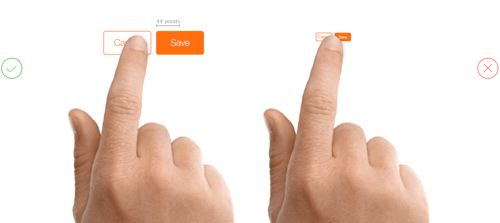
Every designer is informed that responsiveness is compulsory condition for every design, so functionality and usability should also stay perfect. If the buttons are easy to click on a desktop device, they should be easy to tap on a touch display of a mobile device. Tap buttons should be larger and more noticeable than click ones.
Conclusion
Every time you start to create a design, think like a user. If you know the needs of a regular user, it would be much simpler to create a great design and provide users with a really pleasant user experience.