Typography is the Queen: The Collection of Type Focused Front Pages
First impressions are the strongest and the most long-lasting ones. The size, weight and style of typography mean much more than just a way to display text. Fonts affect a user experience and influence the mood of a user. They are able to create an impression right before a visitor clicked any button or read a single word. Typography can go beyond a simple storytelling helping a user to understand what the site is about.
Fonts that you use for sharing the information on your website can reflect the intonation, the tone of voice, and overall atmosphere. Focusing on typography is the trend that never gets old and always stays relevant when it comes to web design. Before developing a front page, define what you want to say with your website, ask yourself how exactly you want to express your idea. Make your typography distinct enough to establish the right mode of your conversation with a visitor and create the recognizable personality of the website.
The following websites look unique and appealing thanks to large and original typography. The type is used here to engage a user and cause more interest in the website. These examples can show what is the innovative usage of type and how it affects the overall impression.
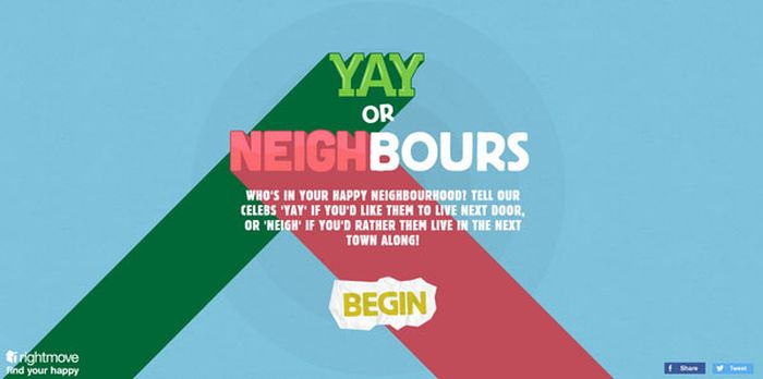
1. Rightmove
This site is a great example of typography focused design where cartoon letters create a friendly and positive atmosphere. The content here is a center stage, and it evokes only pleasant emotions. The tagline is perfectly complemented by the picturesque environment.
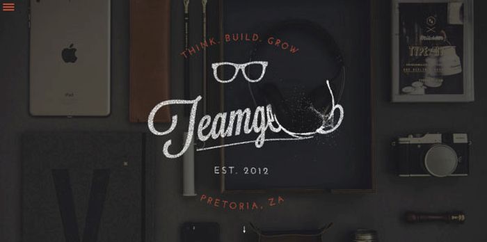
2. Teamgeek
An attractive badge-style logotype is built as a particle slider and creates an unusual effect of dispersed particles every time you hover over the center of the page. As the user can change the shape of the logotype it creates a kind of interactivity and fun while staying on the page.
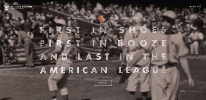
3. St. Louis Browns
The semi-transparent typography is located on the dramatic image background which is represented as a series of slides. Typography effectively blends a composition and stays a significant element of the whole design.
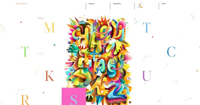
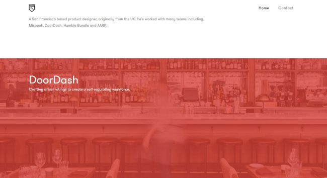
4. Matt Luckhurst
Beautiful and colorful serif letters meet visitors on this site making it fun to stay on the page. A sample of a certain project pops out of every letter when hovering on it. This page shows a way to use typography as a graphic element which is integrated into the design.
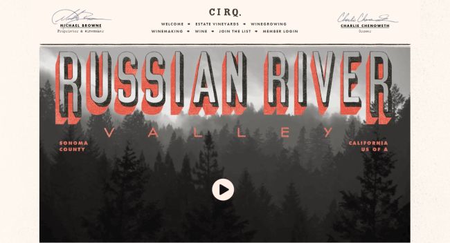
5. Cirq
This website for a vineyard is designed as an old poster which makes it look really unique and progressive. The overall design has a kind of vintage flavor and its color scheme makes it look ingenious. Moving shadow behind the logotype creates additional visual interest.
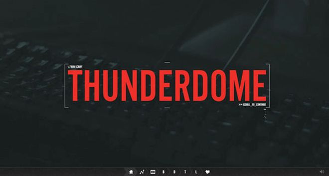
6. Thunderdome
An appealing landing page design with a muted image backdrop and unique tagline which helps the site stand out from the crowd. A minimal two-color design makes a page look neat and simple, so the whole attention of a visitor is focused on the content and attractive typography.
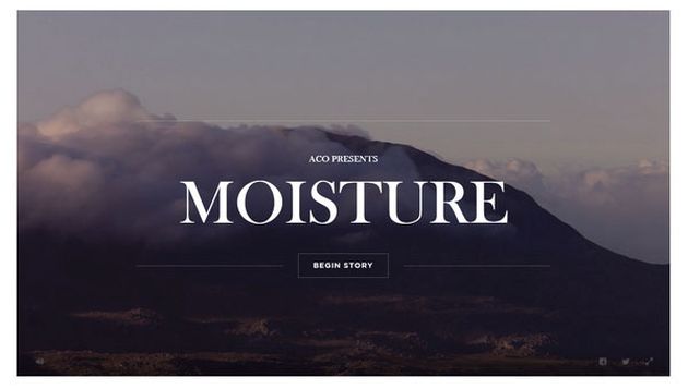
7. Moisture
The beauty of nature which is expressed in the moving background produces an amazing impression. The greeting phrase on the front page is the centerpiece of the main page. A kind of interaction is available for a visitor when pressing the key to change the events highlighted in the video.
8. Max Di Capua
A modular system represented on this front page creates a situation when a layout and typography work side-by-side. The heavy fonts are widely spaced so they don’t clutter the design. All titles in a readable serif typeface emerge alongside the work.
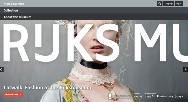
9. Rijksmuseum
The custom typeface consists of large letters which continue off the page calling a visitor to rotate it and see the name of the museum. Beautiful full-screen slides include the photos of the museum’s content. Typography is sure to be the first thing to pay attention at.
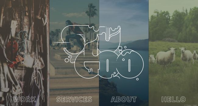
10. Stugoo
The splashy elegant type located on a muted background looks like boiling water bubbles. The logotype is located on top of four background blocks featuring the menu pages. A massive type spices up the page design adding a touch of creativity.
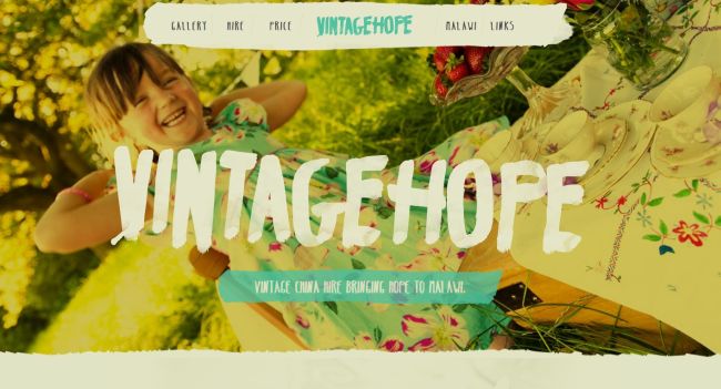
11. Vintage Hope
The tagline here looks like it has been drawn with a thick brush. Such heavy strokes of the typeface are expressive enough to pay a visitor’s attention once they enter the website. A nice photography on the background creates a kind of openness and freedom reflected in the design.
12. Fibersensing
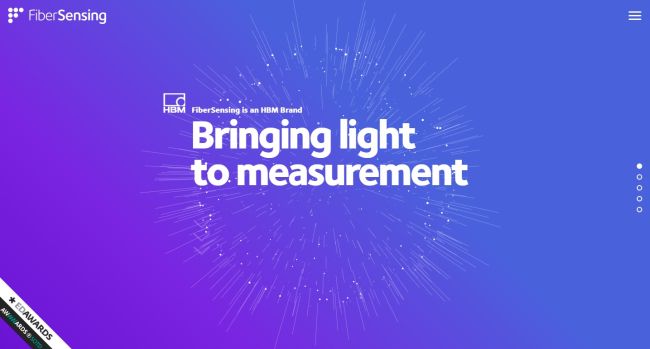
An interactive background combined with the static foreground creates an eye-catching appearance of the website. Smooth solid typography is combined here with dynamic canvas and a gradient. All of this makes the tagline look really impressive.
13. Marianne Brandt
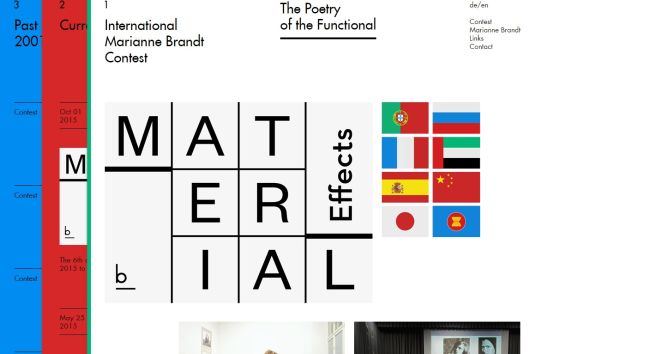
The minimalist front page with clean design and Futuna font looks very unusual and stylish. A user can choose either English or German language but the type style remains bold and engaging. A few sections of the site are opened when flipping through them with the mouse.
14. The Wanderlust Storybook
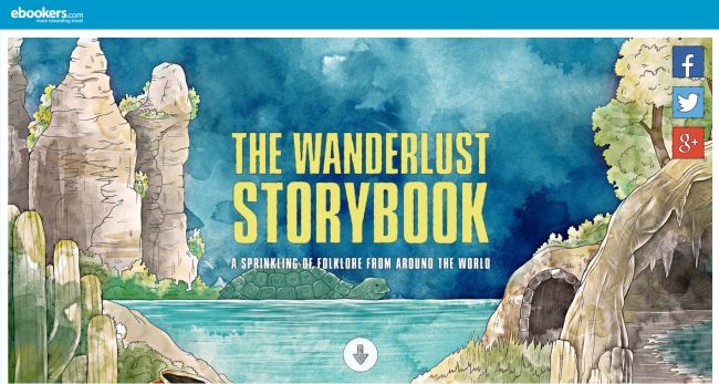
The background of the page looks like a watercolor illustration. The tagline located in the center of the page is sure to catch a visitor’s attention once they enter the site. The boldness of the type is used to convey a significant message to a user. All images here also look like the ones drawn with the watercolor.
15. Melanie DaVeid
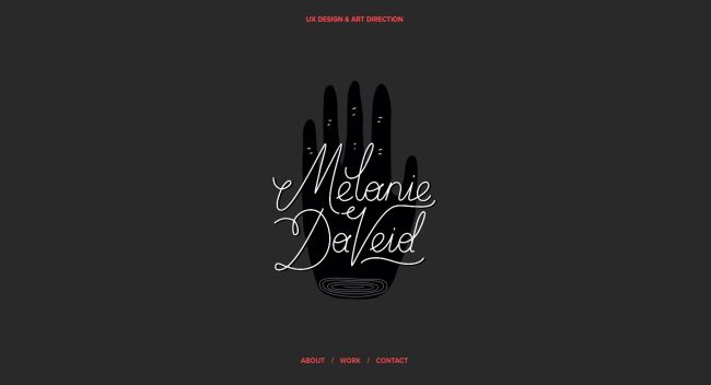
A refined and ultra-thin type can also look as gorgeous and appealing as a bold one, if it is surrounded with appropriate environment. A dark colored landing page of this personal portfolio is minimalist enough to turn attention to typography.
16. C2
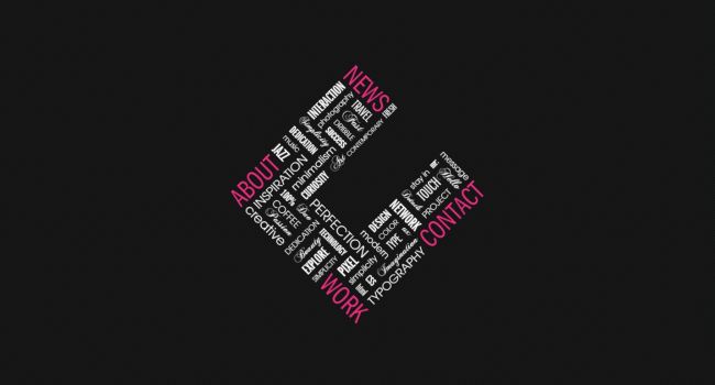
The tagline of this agency serves either as the unusual navigation menu and the animated logotype consisting of thin and elegant typeface. Such a unique effect makes the front page of this agency look splendid. The dark shades make the design look stylish and chic.
17. Caava Design
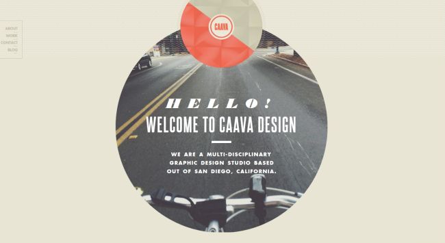
Sans-serif typefaces used for the tagline look neat and maintain a clean aesthetics. Typography here is large and easy-to-read, and italics used for the introduction stand out from the crowd. The written content here doesn’t detract from the portfolio page.
18. Ecc Lighting & Furniture
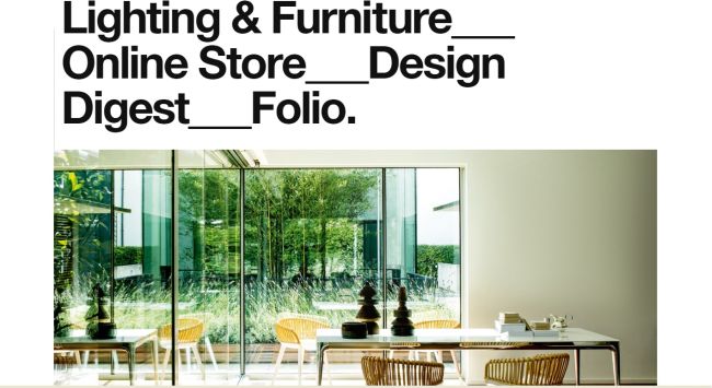
Helvetica font takes a center-stage on the front page of this website. Bold and large category buttons are here to grab a visitor’s attention. Minimalistic design and crisp images just complement the typography focused design of the website.
19. The Crumpled Ball
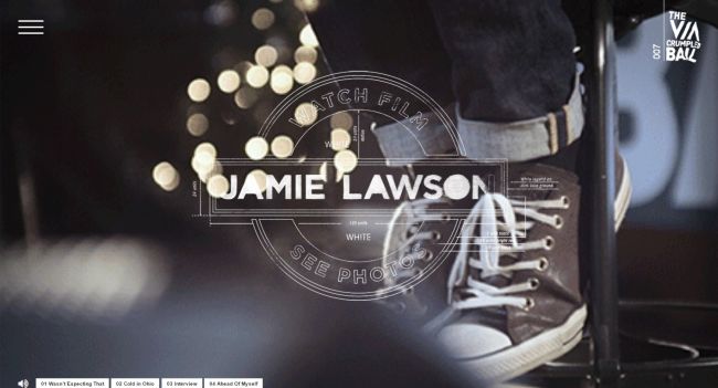
This website looks really extraordinary featuring a slight retro touch together with interesting badge-style logotype. A few various fonts reflect the concept of the project and focus the user’s attention right from the start.
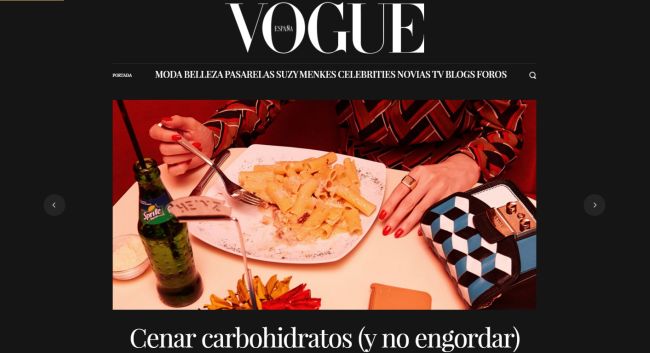
20. Vogue
A Playfair Display font is used here to set a bold and engaging tone. This is a serif style font which perfectly corresponds the Vogue’s brand. Amazing slideshow on the front page complements the tagline and unveils the concept of the brand.
Conclusion
All of these typography focused front-pages can become good examples to follow if you want to catch your visitors’ attention and make them come back to your site again and again. Feel free to share you impressions, emotions, experience, thoughts or questions on this subject in the comments.
