
Ways to Improve Navigation for the Mobile Web
The amount of mobile users outpaces the number of desktop devotees day after day. Many people today use mobile devices not only for mutual communication but also for reading news, watching videos, purchasing products and services. It goes without saying that creating a website with responsiveness in mind is a high-priority task.
Experts say that mobile traffic has been increased by 18 times in the last five years and it keeps on growing month on month. The service by Google known as Google Developers has published a statement that webmasters are highly recommended to use responsive web design as it is the industry best practice. All of this allows to realize that a responsive design which is required for attending websites through mobile devices, is an impactful way to attract more visitors, increase conversions and boost a website’s rate in the search results.
Navigation is a key element of a user-friendly website. If web-designers are focused on mobile navigation, they allow users easily find whatever they need and get positive user experience. If the website is easy-to-use and responsive, it attracts more visitors; and attracting visitors is the main aim of website promotion. We will try to indicate main possible ways to improve mobile navigation for contemporary users.
Main Menu Icon
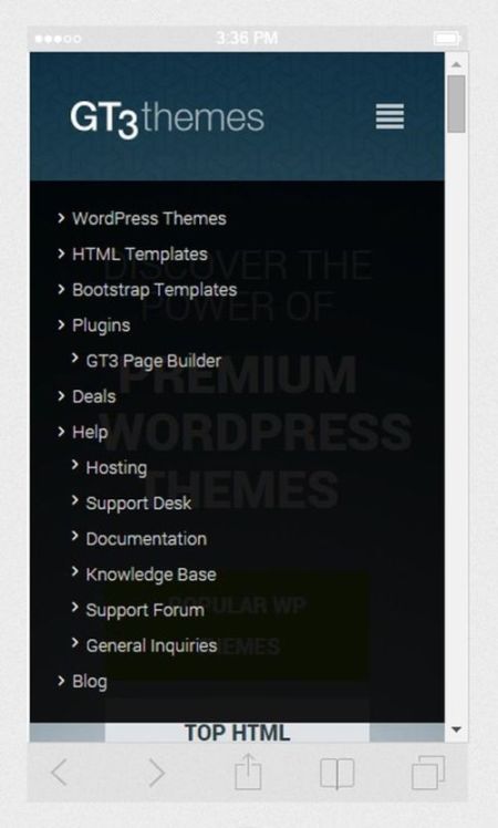
When a user enters the site through a mobile device, they want to get easy access to all its categories and find any information without a delay. Clickable menu navicon located in the header area of the website is the main element which has to be available in any responsive design. The icon can look like a “nav burger” which is the recognizable symbol for many users and allows a user find the required content within a few clicks. Menu icon is one of the key elements of intuitive design.
Search Feature
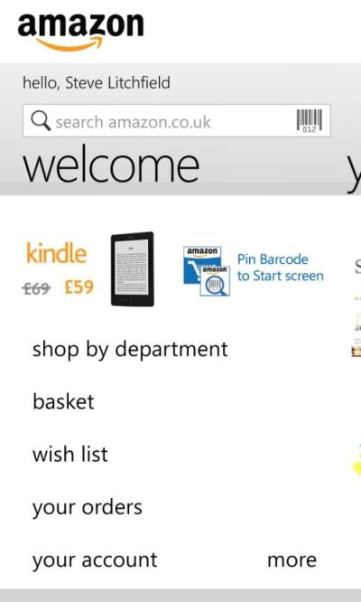
As the screen space is important on mobile, it is better to be specific with elements you include in the menu. Search feature is considered to be essential and highly required element of any website design. As it helps desktop users to find any information quickly, it will be much important for mobile users to feel comfortable online. Search feature should be easy to spot at once a visitor starts to browse a website. That is why the best variant is to put a search field at the top of the screen.
Associated Categories
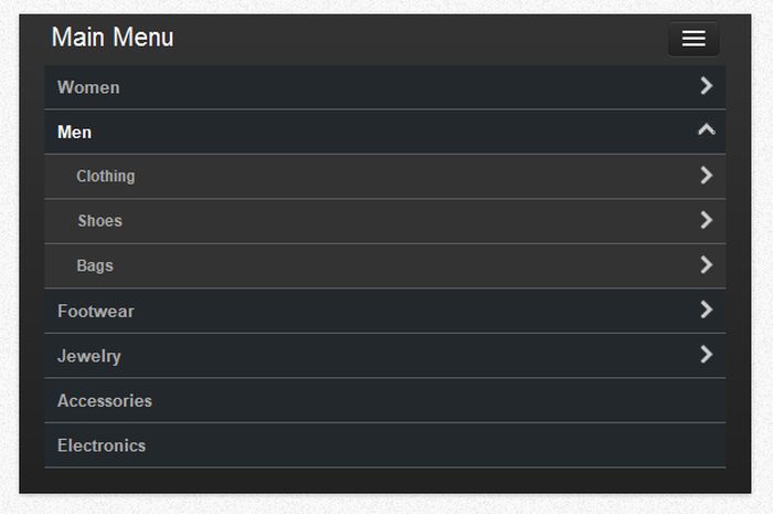
Categories that will be visible for mobile users should be sorted depending on the type of a website. If it is a corporate site, the “about us” and “contacts” categories would better be the first to observe. If you design the online store, than it is better to give users a possibility to easily find everything they want to buy, so a direct access to purchase categories will be more useful here. For instance, if you make a clothing store, make such categories as “Women’s Wear”, “Men’ Wear”, or “Kids’ Wear” easy to find. Clicking on one of these major categories will allow the user get on the page with related products and find everything they are looking for.
The Ability to Share
Many mobile users have got a habit to share everything interesting they find on the Web, that is why the share icon would be a really important menu element which has to be available on the website. The ability to share the information is the sign of social proof, and it confirms that an article, an image or a product deserves to be further read, seen or bought.
Thinking in the context of a broader reality allows to make sure that a share icon is even more requested for mobile users than for desktop ones. It is obvious because the more users apply the mobile Web, the more folks will be sharing on mobile rather than on a desktop.
Limit Navigation Sub-Menus

Modern mobile users are very impatient, so it is essential to limit the number of clicks before a user reaches the sought-for product options. Quick and easy way to get on any page is the obligatory “component” for creating a successful responsive design. The user won’t waste precious seconds on selecting new and new sub-menus and stick around to “reach their aim”. Limit your site up to three navigation sub-menus allowing the users find what they want within just a few clicks.
Don’t allow the competitors win the “contest” for the best thought-out responsive design.
Conclusion
As the mobile Web is going forward, it is imperative that a web-design is minimalistic, intuitive and easy-to-use. Nothing should distract your users from browsing the website’s content and nothing should make them feel “constrained”. Easy navigation is one of the numerous things that determines a website’s popularity. It is the thing which allows a user visit a certain site, search and share the information, buy products, watch photos and videos, and perform any other actions through mobile devices again and again.