Why Its Important to Create a Custom 404 Page?
404 error pages usually appear when a website page was deleted, the link was broken or its name was mistyped and such page doesn’t exist. The 404 HTTP status code defines the content which can’t be found, a visitor doesn’t get a guide on how to reach the necessary page, so they should make it by their own. Create a custom error page to motivate your users stay on your web-page to find the required data, and help them easily navigate through your website.
Why custom 404 pages are helpful?
Some website owners tend to create custom error pages for their users because there are a few reasons for this:
- Such page allows to provide the information on how to find the required page on a website.
- It can be fun to look at if you create an original design.
- A custom error page with cool design reduces the frustration and negative experience which users face when they see the error page instead of the one they were looking for.
The Way to Set Up a Custom 404 Error Page
Creating an error page is as easy as building any other page in your dashboard. Although if you need it to look original, it’s better to entrust creating its appearance to a designer.
When building the structure of this page, remember that this shouldn’t be completely automated – prevent it from appearing in your sitemap or menu. Don’t forget to build an additional 403 page to cope with denied access errors.
In this case, the logged out users won’t see 404 error when they try to open a page.
404 Page and SEO
Of course the 404 error pages won’t be indexed by the search engines, ‘cause the 404 HTTP code informs them not to do so. So, if you’ve got a custom error page which appears instead of the broken links, no need to worry about the right indexing. Only quality pages of your website will be crawled by SEO spiders to provide your users with necessary content they are looking for.
How to create a quality error page?
A 404 error page should motivate users to continue browsing your website instead of leaving it. So try to:
- create a clear and visible “not found” message;
- make the error page design which is consistent with your website design;
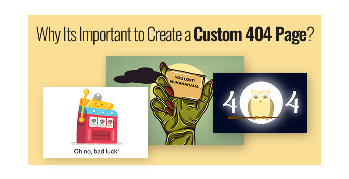
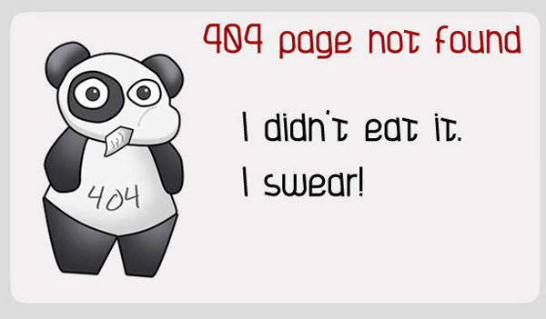
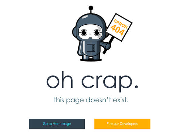
- make a funny and original error page instead of a standard one.
If you run a blog and you need more visitors and subscribers, an error page can also help. For instance, you can motivate your users stay with you and continue browsing your website by offering a free gift like an eBook, a freebie, a shipping voucher, etc. You can also place a link to the subscription page and offer a gift for subscribing.
However, it is also important to place the links to the important pages of your website to get more traffic exactly to these pages. Every link should be explained to get visitors understand what they can find on these pages and how this information will help them.


