Pure Free Portfolio WordPress Theme
-
Requirements:
Latest WordPress | PHP: 8.0-8.4 -
Theme Description:
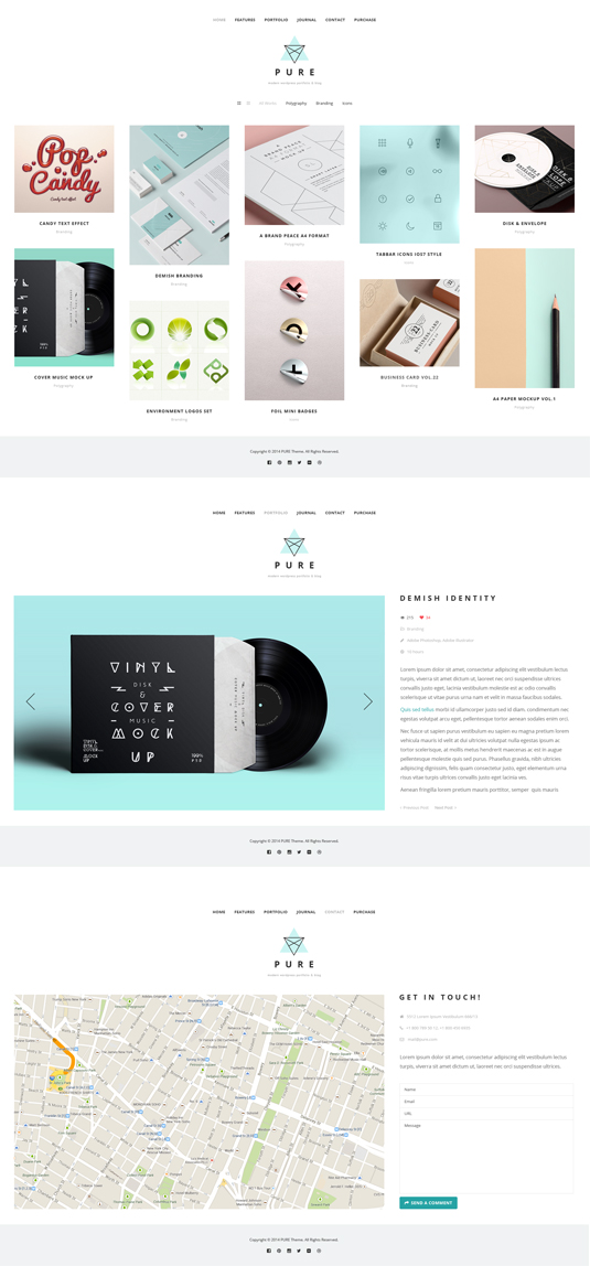
Very concisely and appropriately named, Pure WordPress Theme effectively underlines our main idea to help you display the elegant web presentation on the clean canvas without any distractive elements.
This ready-made solution is specially designed for creating beautiful portfolio or blog projects which will compare favorably with the rest. Simplicity of this theme shows the way modern and professional website should be displayed. Transparent style and refined look compose the perfect minimal concept of the overall design. Intuitively, your visitors will pay more attention on the content which is organized in a well-defined structure.
Speedy, fully functional and, at the same time, flexible, this Pure Theme is powered by WordPress software which gives the great potential and strong capabilities to this item. And you can prove it by checking the Live Demo and see our theme in action. Home Page opens with the dropdown navigation menu and catching header which you can replace if you want. We set Portfolio in the content part and it’s arranged in the grid layout, though you can choose other filters (Photo listing grid, All, Branding, Polygraphy, Video) to view the page. In Journalyou can post your blog entries in different styles, such as Grid, Masonry, fullwidth, single image, single slider, single youtube or single vimeo.
Concerning the main features of the Pure WordPress Theme, we should mention about stylish typography, included About Page and 404 Error Page.
During the editing process, you may need some good designer’s stuff for customization. So you will find icons boxes, portfolio posts, accordion & toggle, blog posts, gallery, promo text, tabs, testimonials, partners, message boxes, progress bars and custom buttons within this theme.
Being fully responsive and retina ready, Pure WordPress Theme will bring a new sense of style, creativity and purity into your web project. And what can be more effective than a perfect blend of elegance and powerful functionality all-in-one product? If you love good design, Pure WordPress Theme is made right for you!


Is there any video tutorial for a this theme?
Hi! First of all say that I love the theme. It was quite easy to instal, but I was wondering it the download content is available? I have not found it. It would really help me out because I’m having problems building it from scratch. Than you!
Julia,
On your dashboard, click “Pure” (under settings on the left sidebar). Scroll to the bottom of “General” settings and there is a “download demo content” button. That should work.
That was easy..whoops. Thank you!
Hi guys. Awesome work for Desktop portoflios! Just one question: I’m accessing the portfolio page from my Android phone and it’s not displaying properly. Elements are not centered, nav menu is left aligned, etc. Have just tested with an iPad Retina and everything is also screwed up! Is there any reported issue about mobile compatibility for this Pure GT3 theme?. Looking forward.
Hi. I ran across this problem a few minutes ago. There appears to be some glitch that occasionally occurs when shifting elements around. It looks like sometimes the plugin puts the section INSIDE another section rather than below/beside it. Presuming that you have more modules on the page other than the portfolio, of course. What worked for me was jest redoing the page all over again, placing the elemts in the order i want them to be in. It’s a pain, but it works.
Hi Kevin, thanks for taking your time and trying to give me advice in how to solve my issue. I’m currently using the portfolio page without other modules within it. The footer is also displaying wrong in mobile (please take a look to the attached screenshot). Does your method also solves this problem (footer issue). Everything seems not to be centered properly. If you have some minutes, please visit my website (http://solkaczka.com) from desktop and mobile to see the difference. More detailed steps to solve this issue will be appreciated. Cheers from Argentina!
Hi Kevin, thanks for taking your time and trying to give me advice in how to solve my issue. I’m currently using the portfolio page without other modules within it. The footer is also displaying wrong in mobile (please take a look to the attached screenshot). Does your method also solves this problem (footer issue). Everything seems not to be centered properly. If you have some minutes, please visit my website (http://solkaczka.com) from desktop and mobile to see the difference. More detailed steps to solve this issue will be appreciated. Cheers from Argentina!
Hi! I have installed the theme but now I don’t know how to show more than 10 projects at the work/portfolio display? As soon as I add projects the old ones disappear. It looks like there is a page 2 but when you click on that nothing appears?
athieu Meeldijk Keline • a month ago
Of course : when you want to create a portfolio on one of your page, you use the GT3 page builder below the text area. You click on Portfolio and it appears below. Click on the green pen on the right and modify the value of “Items per page”. I have put 999 but you can put as many 9 as you want. Hope it helps !
hello! great theme! love it!
I’m working on Portfolio pages, “image format” and using style 2. But i have a problem to see the pictures of the slider, because the format of the slider is fix and horizonal, but i have images that are vertical.. so, the frame of the slyder cut my vertical pictures (people without head!! :)).
Please, can you say me how to modify the format of the slider, in order to get the pictures in a full way?
Thank you very much!!
Carolina,
I had the same problem. I fixed it by cheating. I added enough of a white border around the images so that the only thing getting cut off was the border. My images are still plenty big enough. After all, the images are displayed at 1170 pixels wide. Hope this helps.
Ok, it is a solution… 😉
Thank you Carolyn!