Pure Free Portfolio WordPress Theme
-
Requirements:
Latest WordPress | PHP: 8.0-8.4 -
Theme Description:

Very concisely and appropriately named, Pure WordPress Theme effectively underlines our main idea to help you display the elegant web presentation on the clean canvas without any distractive elements.
This ready-made solution is specially designed for creating beautiful portfolio or blog projects which will compare favorably with the rest. Simplicity of this theme shows the way modern and professional website should be displayed. Transparent style and refined look compose the perfect minimal concept of the overall design. Intuitively, your visitors will pay more attention on the content which is organized in a well-defined structure.
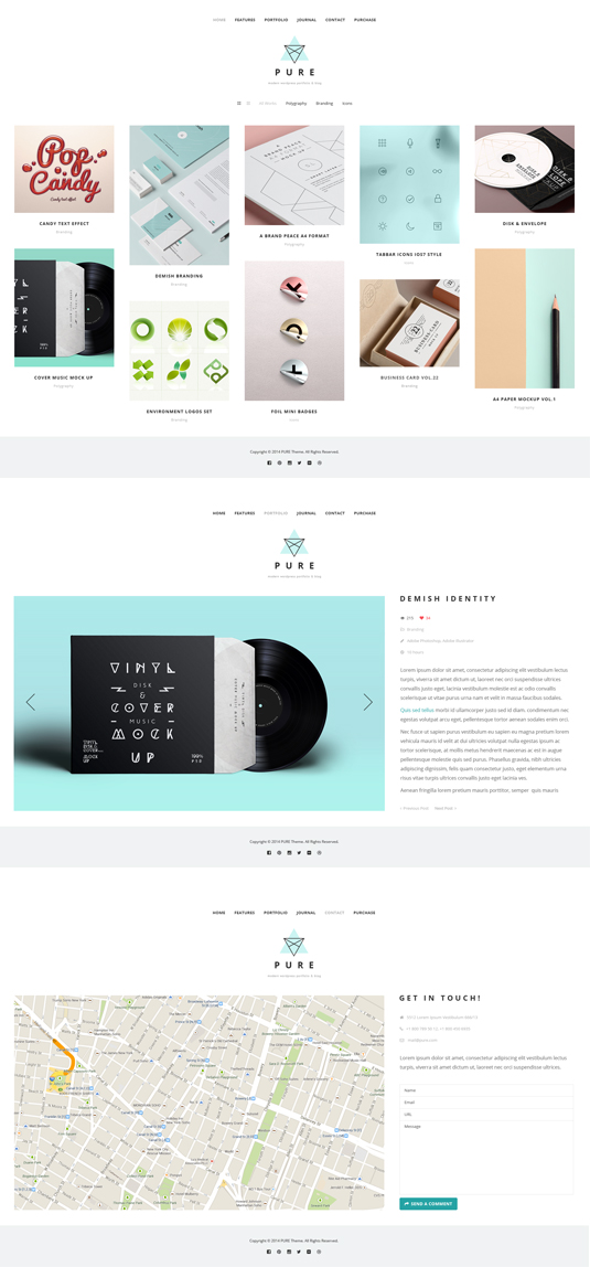
Speedy, fully functional and, at the same time, flexible, this Pure Theme is powered by WordPress software which gives the great potential and strong capabilities to this item. And you can prove it by checking the Live Demo and see our theme in action. Home Page opens with the dropdown navigation menu and catching header which you can replace if you want. We set Portfolio in the content part and it’s arranged in the grid layout, though you can choose other filters (Photo listing grid, All, Branding, Polygraphy, Video) to view the page. In Journalyou can post your blog entries in different styles, such as Grid, Masonry, fullwidth, single image, single slider, single youtube or single vimeo.
Concerning the main features of the Pure WordPress Theme, we should mention about stylish typography, included About Page and 404 Error Page.
During the editing process, you may need some good designer’s stuff for customization. So you will find icons boxes, portfolio posts, accordion & toggle, blog posts, gallery, promo text, tabs, testimonials, partners, message boxes, progress bars and custom buttons within this theme.
Being fully responsive and retina ready, Pure WordPress Theme will bring a new sense of style, creativity and purity into your web project. And what can be more effective than a perfect blend of elegance and powerful functionality all-in-one product? If you love good design, Pure WordPress Theme is made right for you!
Hey, where can i find the demo content from the theme? thanks!
is there any way to remove the featured image from portfolios and posts?
I’m looking for this, too. Since setting a featured image is necessary to creating a thumbnail in the portfolio page, there should really be away to set that separately from the content of the portfolio page. @GT@gt3themes:disqus
Can you tell me if there is a way to centre the masonry/grid portfolios on a page. Mine always appear on the left-hand side. Thanks!
I was looking for an answer for this too can anyone help?
Hi, anyone having problems with this theme on mobile?
Specifically, I want the logo image (which is more like a wide header in my case) to scale on mobile and tablets/screens of varying sizes. Instead of a pixel width, can I make the width be a percentage of the page width?
Is this the best way to do it?
Thanks!
Hi All, just in case anyone else had this problem… I have discovered that in the “HEADER LOGO WIDTH” you can indeed input 90% or other percentage which scales the header image on mobile and small desktop windows.
The only problem now is that the header is left aligned, not centred. How do i change this?
Header type 1 and 2 are both aligning this image to the left when I input a percentage rather than a pixel width.
Thanks!
Instead of using a percentage you can enter the “functions.php” file where the theme logo is loaded. Instead of “width” write “max-width” (line 512 and 517) so it will scale to the max width where displayed on mobile devices.
The other question i have regarding mobile display, is to do with the gt3 page builder.
I have used the gt3 page builder to arrange my content. Mostly in thirds, which looks fantastic on desktop, but falls apart on mobile.
Is there a way to force each block of the builder to appear under each other at 100% of the mobile screen width, rather than side by side?
I imagine it similar to the blog post homepage where on desktop there are 5 columns of blog posts, but on mobile we scroll down one post at a time.
Thank you for your help with this!