The Easiest Ways to Diversify Your Mockup Designs
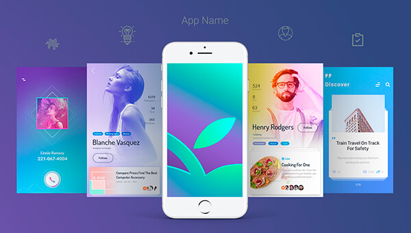
Mockups are usually used to show a concept of design to the potential client and prove that this concept will look and work well when it becomes a full-fledged app. All elements in a mockup are displayed in excellent quality, they show a concept in final form to make a client decide whether to buy this app design and use it for their needs.
There are several ways to make your mockups more diverse and convincing. And here are a few methods how to make it possible:
1. Carry Out Important Tasks
If you develop an app, your mockup is made to demonstrate its essence. The important task here is to show a client that your app’s functionality really solves the problem which it has to. Every app is intended to perform a definite task, so the mockup should show that this task is easily fulfilled.
When you present your app mockup to the client this way, it leaves a positive impression and it allows to discuss all details on the functionality and design of an app before you sell it.

2. Interactive Design
It goes without saying that interaction is the important part for a user experience today. So it’s essential to add interactive elements into your app mockups to make it fun and simple to use and examine. Use the UI design tools or animation software to spice up your mockup design and make it entertaining to work with.
You can use animations for page transitions to show how smooth they can be. You can also apply different cool effects to buttons and other tapable elements.
3. Good Content
You can find a lot of similar apps and see what texts the developers use as a sample content for demonstrating their works. Don’t use lorem ipsum text for your mockup, this is not impressive and sometime irritating for a client.
Use royalty free images and some meaningful texts. You can just take from other resources and rewrite them to meet your needs.
4. Real Devices
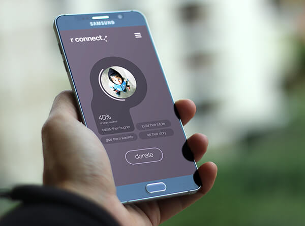
Of course there are many services that imitate the screen resolutions of different devices, but it’s always better to demonstrate the future app on a real device. If the mockup is static, then it has to be shown in real looking circumstances and in realistic situations. For instance, make a photo of a hand holding the device with your app on the screen.

5. Focus On What Really Matters
At the end of your work you will have a lot of details that you consider to be important to show and discuss with your client, and your final task is to make a client be satisfied and make them buy your app as a result.
However, not every detail should be unveiled during the first demonstration. Some things are obviously more relevant and important and others are not. Focus your attention on the main functionality and the screens that a user will interact with on a constant basis. Make all the main functionality accessible in the main menu right from the start.
Conclusion:
You can also use some of your own methods that you consider to be efficient and that you often use to promote and sell your app to a client. However, if you are a newbie, then the mentioned above tips are sure to come in handy.
