Impress Users with Splendid UX: Main Tips
A delightful user experience starts from a great design, and this is easier to fulfill than you can even imagine. It’s important to start thinking like a user every time you begin creating a new piece of artwork for the Web, and it’s significant to remember you build something you want users to engage with again and again.
No need to reinvent the wheel every time you create a new design, it’s better to use the approved tools and techniques and then just concentrate on crafting visual elements that make a design attractive.
In this post we’d like to share some special tips on how to make people admire a user experience they get when visit your beautifully designed website or launch a new application.
1. Keep it Individual

People often want their experience to be personal and they want to believe every site or app is created just for them. Every time your users make online shopping, play a game or visit a site, they want it to work for their own needs, so personalization is one of the biggest trends today.
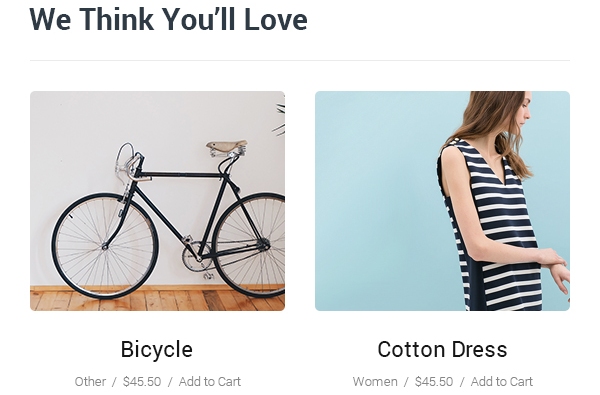
When a user reads a certain post, display the recommended posts based on the subject they are interested in. The same thing is with web stores, movie portals, culinary websites, and more. You can just suggest the related products, recipes, articles, photos, and any other content depending on the interests of your target user.
Such approach will help increase loyalty and engagement, so this is the very aim we pursue.
2. Use Animations Wisely

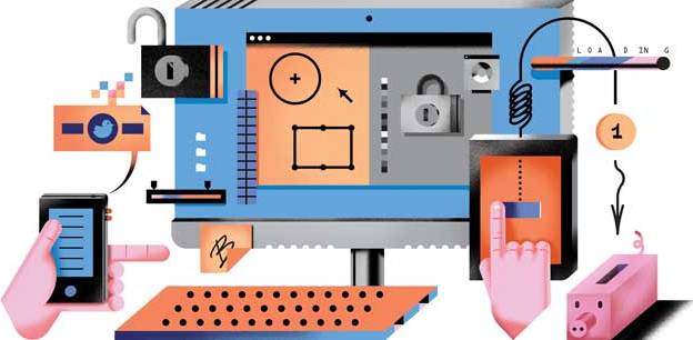
Keep your animations simple and meaningful. Just remember that every animation should carry a purpose and be as simple as any other design elements. Don’t keep your users puzzled or dizzy and use the animated pictures only if they help to reach your main goal – provide an impressive UX.
- Let your animations be a method to enhance usability and juice up a design.
- Make your animations propel the design to awesome status.
- Make your animations interactive and let them move as a user moves a mouse around.
- Use animations to make your design as awesome as possible, for instance, create the animated menu items to reveal submenus, etc.
These rules will be helpful to keep your design purposeful and engaging.
3. Use Commonly Accepted Patterns

Design patterns are repeatable and commonly recognized solutions applied to the troubles that often occur. In other words, patterns suppose something which is commonly used for classifying the pieces of information, clicking or tapping a button to perform a certain action, scrolling down or up to find the necessary data, and so on.
These patterns make every design intuitive and users won’t have to think through to understand how to interact with a certain element on a page.
Common visuals should look and work identically on every page of your website to give the impression of a complete design which is easy to perceive.
Use the same color of CTA buttons from page to page, choose identical typography for headings in articles on every new page, and so on.
4. Give it Identity

Your design should have the same identity as your brand to make target customers associate it with your trademark, your nature of business and services or products you provide.
Take the experience of popular websites for a model and bring your own ideas into life, that interesting mix will help you create something very special.
Make your design fun to look at and simple to interact with.
5. Consider a Screen Limit

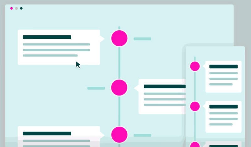
Every experience is limited to one screen at a time so it is essential to consider a volume of data conveyed on an on-screen container. If you use a long scrolling, then a user gets every new portion of information available within a size of their screen as they scroll down the page. Parallax technique is popular in this case ’cause info blocks beautifully move on the page and create visual interest.
A device-centric design makes it easy for a user to find any information and easily navigate through the website.
Make sure you create a responsive design and you bet it looks great on different screen resolutions.
6. Interactions Matter

Interactions always make any design exciting and engaging for a user. Fun is the thing which makes all the difference. Some small online games, eye-catching videos, polls and surveys as well as other interactive elements will get users react, and this is exactly what we need.
Don’t make your interactive content too involving and keep it simple for users to respond on the fly.
Attention spans are very short, so be sure your engaging elements are easy enough to be understood in seconds.
7. Keep it Well-Structured and Simple

Simplicity, minimalism, order and tidiness should be the first things to consider when you create a design which gives a splendid UX.
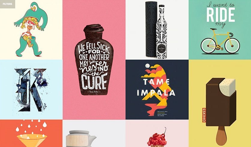
Card-style, grid-view, and other useful methods will make your design look neat and get your users feel satisfied with their experience.
Of course, responsive, cross-browser compatible and retina-ready layouts are important here as well.
Conclusion:
Just think like a user and create a design that users want to get. A great UX is something which is easy to perceive, understand and interact with, and of course, it is simple to navigate. If you have anything to add or you can share the examples of amazing UX or UI, don’t hesitate to leave your comments below.
