The Future of User Experience: Motion Design
Times of heavy flash animation, intrusive ads and numerous gifs have already passed. Modern animation is clean, easy-to-navigate and smooth, and it causes no confusion anymore. Technologies like CSS3 and HTML5 allow to incorporate movement onto a webpage without making it heavy or unattractive. Today’s motion design, if it is used sparingly, helps to perfectly improve the user experience.
We will talk on the methods to use animations on a website without obstructing the UX and without overloading the page. Review the most efficient ways to use compelling motion design and keep movements organic and natural.
Page Transitions
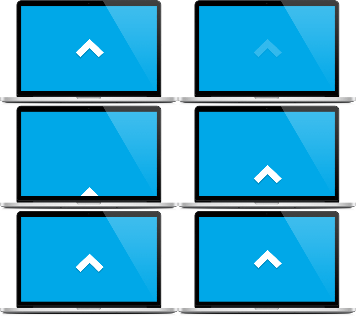
Animation between pages is considered to be a really efficient way to add motion to your website without cluttering the UX. This method is applicable for creating amazing navigation effects when revealing a new page. Transition styles are ranging from circles and tunnels to waves or even diamond shaped transitions.
Page transitions add a visual interest between pages, visitors will see smooth transitions between your web pages when they come to your site. Actually, such pages load quickly, and a gap between them is filled up with fluid animation.
Slow Motion

Slow motion is another awesome way to integrate animation into your website. All elements will move gracefully and slightly over a certain period of time and automatically call the visitor’s attention. When the moving is subtle, the user wants to explore the object attentively to make sure it really moves. If you draw an eye of your visitor in the first instance, you can make sure they stay on a page for longer.
In real world objects usually move at different speeds, they start slowly, then they pick up a speed and slow down before they come to a stop. If you use a slow motion on your website you make it naturally resonate human brains and make your users perceive a website in a comfortable way.
Infinite Scrolling
This is a trend which is also called a long-scrolling one and creates a number of opportunities for navigation, visuals and storytelling. Infinite scroll allows to keep all the uploaded data in one place so users can scroll the page down until they find what they need. Such technology is also a good choice if you don’t want to navigate a page through lots of submenus.
Infinite scroll is a great way to integrate motion into the web page if its components are solid and clean. You shouldn’t confuse users with too much motion and it is useless to put a lot of colorful blocks on the page. You can just use large background images and grid technology together with the pleasing color scheme to create simplicity and style.
Modular Scrolling
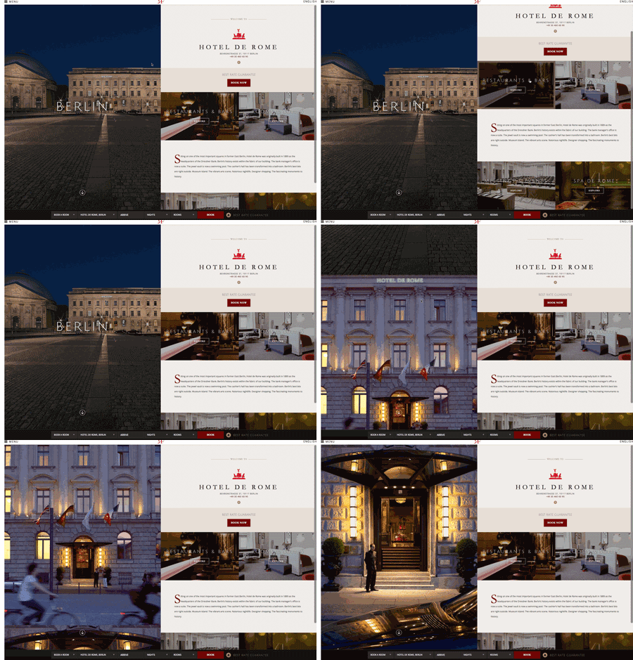
Separate columns can be scrolled as well as the whole pages. If you use modular scrolling, you let your users control over your website’s animation. Your users can scroll every panel individually and review any certain information they want to learn. For instance, users can either scroll through the panel of images or they can examine the panel which includes a company information.
Controlled modular scrolling reflects the ability of our brain to process information on multiple levels. All text information and images are introduced as a kind of thought-tracking when every visitor can review the company’s portfolio and scroll the related images in another panel. Just keep the design elements simple to allow for all the motion not to overload users with plenty of information.
Animated Schedules and Charts
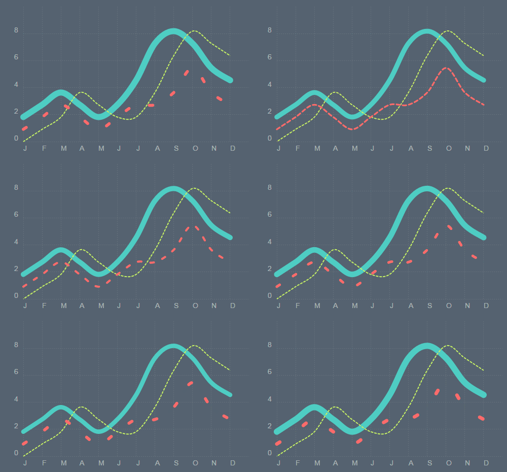
Animated schedules, graphs and charts are not only fun to look at but very easy to integrate into the website. They add only a tiny portion of movement to your web-page and create a kind of entertaining infographics. Spice up your graphs with animation instead of using average diagrams and schedules. Animation is sure to add a little flavor and variety to your charts and is sure to impress your coworkers, partners, and customers.
Inline Anchor Animation
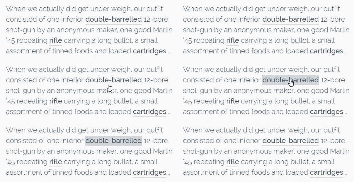
Hovering is currently a widely-used effect on any website. Today’s motion design trends have transformed hovering into a handsome and showy way of highlighting the clickable anchor text. Using such effects as color negatives, fading letters, text outlines, etc. can visually stimulate a user and keep it fun to click a link.
Anchor animation adds motion on a small scale but it nevertheless has positive effect on a user. Changing a hover text is one of the most delicate ways to add visual interest to your website.
Motion Design for Sign Up, Sign in and Contact Forms

Filling out a form is usually a very boring task. When the form includes a lot of fields, it seems to be even annoying. On the other side, an animated form can make it fun to fill it out. When questions appear once a visitor clicks on a certain field, it seems like they come from a friend in social media and not from a robot, so the process of answering the questions looks like a casual conversation. In this case, users are more likely to provide the necessary information without hesitation.
Use natural language instead of official one to add the overall casual tone of the form. When a natural language is combined with animation, then filling out a form becomes a pleasant experience.
Conclusion
Animation is one of the most efficient ways to add more visual interest to a website, so motion design is sure to improve a user’s interactive experience which is always excellent for any business. You can choose either a small or big scale animation, use a moveable background or prefer just a modular scrolling – just make a choice referring to approximate tastes of your target users. If you prefer using CSS for creating your animations, you can also use current CSS animation tools and frameworks to make your development process easier.
If you have any thoughts as for the techniques mentioned above, or you’ve got any positive or negative experience on using them on your site, you’re welcome to share your opinion in comments.
