Fresh Website Collection with the Most Intriguing Navigation
When it comes to navigating a site, we expect it to be simple and clear. But it is 2015, and the bar has been raised quite high for web designers, so we should probably stop thinking about navigation as one of the most basic elements that is to be taken for granted. If you want your website to be a stand-out, a cool navigating system can add a fun and unique touch to it.
In the below collection most of the sites are interactive. Long scrolling is a big trend this year, so this might inspire you on how to engage the visitors in the process, to make them want to go back to your website again and again.
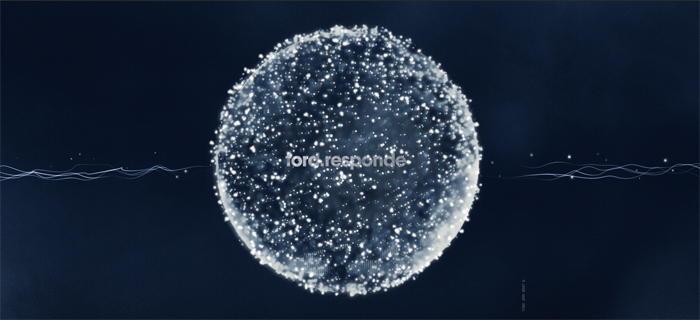
This website was launched by Ford during a car show in Brazil for public relation purposes: fans from all over the world have questions about the cars and technologies, and now they are able to find the answers here. The home page represents a sphere that has been formed by peoples’ questions. When you hover over the sphere, single questions pop up and lead to an answer which can be given in a text, video or audio format. The concept makes the process of using the site quite engaging, and animated elements make it modern and stylish.
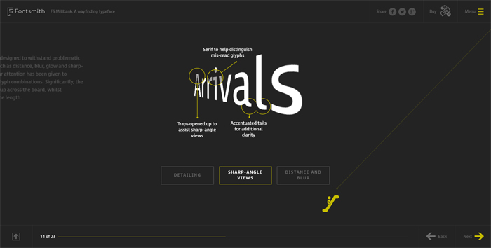
This is a typeface website launched by Taylor Thomas from the UK. The navigation system takes you on a journey through typography for way finding resources. It gives an impression of horizontal scrolling, and it kind of is, but soon you realize that you are being forwarded in absolutely different directions. It intrigues, despite the color scheme that has been selected it is not boring because you don’t know where you are being taken next.
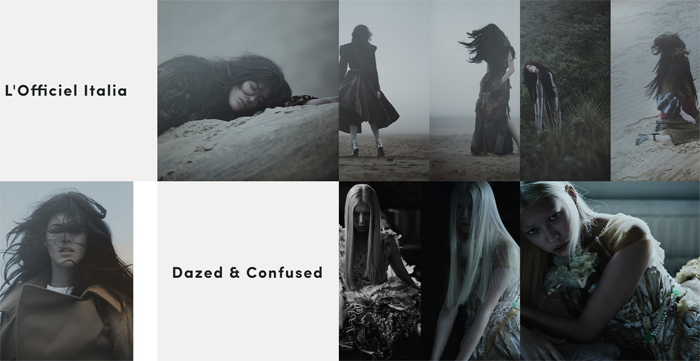
Mathias Sterner is a photographer and director from Stockholm who presents his art on this great website. It’s not only the beautiful portfolio that you get to enjoy, but also the unusual navigation. For a second there you forget where you at, and if it bothers you, there is the hidden menu icon on the left – always at your service.
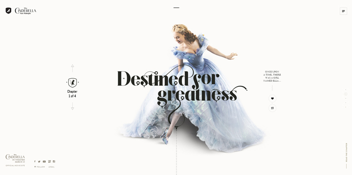
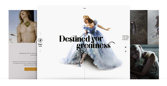
This website is another chance for us to visit this old good fairytale! Cinderella Past Midnight is a stylized representation of the original movie. Here you will find illustrations, images and GIFs to recreate the magical atmosphere online. You can go through 4 chapters that cover the main events. Parallax scrolling and beautiful design engage visitors into the magical world of fairytales.
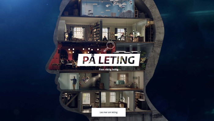
Boligreisen means a living journey. The website belongs to a Norwegian real estate company that aims to help you find your dream house. You are invited to travel though all stages of the process that form the idea of the perfect place to live, and since it all starts inside our mind, the trip starts by getting inside a man’s head. This original website is an excellent business card for the organization: the creativity puts trust in the clients and engages more visitors into having business with these guys.
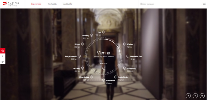
This amazing website gives us an opportunity to enjoy POV videos from different locations in Austria. It inspires tourists from all over the world to visit this beautiful country and to experience the Austrian vibe and culture for themselves. The navigation is pretty logical for this type of site: it resembles a compass, but instead of N, S, W, E directions you get to choose the places that you would like to see in the fantastic showreel.
Giorgio Armani – Frames of Life
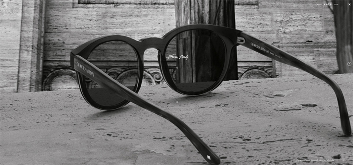
Being a product of and for fashion this site gives you a feeling of watching a beautiful commercial or a frames fashion show. If you have a web cam, you can try them on or simply relax and enjoy how those frames look on five different models. Also the navigation leads you through amazing galleries of places where each model is from.
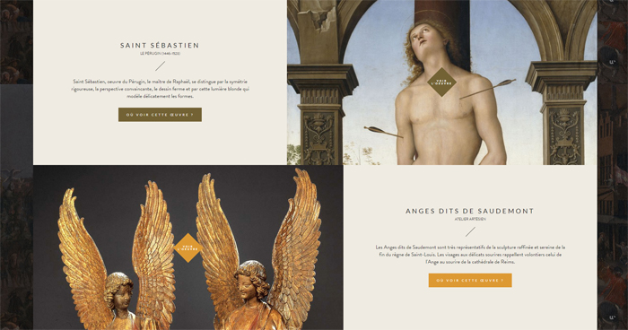
A truly aimpressive website by Wokine from France is an online source for getting familiar with French museums and the most famous pieces of art that are being presented there. Its navigation will make you feel like you are wandering through the halls of Antique, Middle Age and Modern art.

Rally is a studio that produces digital products for National Geographic Society. They build apps for travelers, modern digital guide books etc. The website is called Rally Interactive because an interactive studio requires an interactive portfolio. The navigation is quite interesting: you can go in 4 different directions and a) meet the team; b) see the City Guide project; c) the Snowbird project; d) National Parks project. Each section is filled with detailed information about the studio and the works.
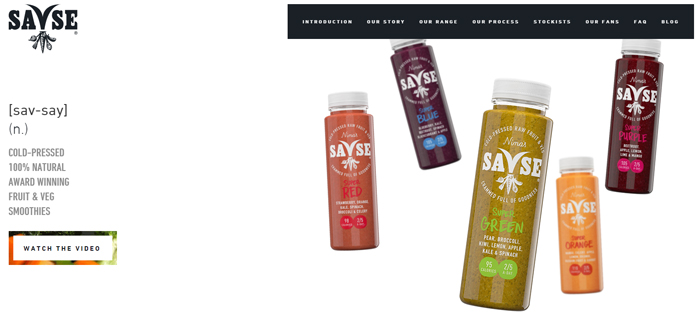
The website is dedicated to healthy cold-press fruit and vegetable smoothies that are being sold as bottled up. The site is minimalist, clean and funky. The vertical scrolling works great for the storytelling concept. Being a one page site, it gives you a feeling of lightness and freshness, just as the smoothies themselves.
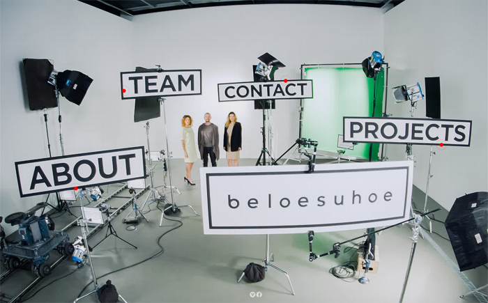
This site belongs to a production company based in Kiev, Ukraine. Being a creative agency, these guys nailed the idea of creative website navigation. It is like you are there, in the studio, going through sets and different rooms, meet the employees and watch the commercial videos.
