Looking Ahead – Web Design Trends in 2015
At the end of the year, we think it will be useful to analyze the last tendencies and predict the main web design trends which are coming to the front in 2015. Looking ahead is always a good idea, especially for those who plan to launch a new website in style next year.
Trends in web design change with time, so it’s necessary for any web professional or website’s owner keep track of events and follow the mainstream directions which help to create modern new sites, make some changes in a current web project or maybe even think about redesigning.
The following trends greatly influence web design in general, gradually transforming new changes into web standards. So let’s get ahead and have a look at the top design trends which emerged in 2014 and more likely will be dominating in the next year:
One Page Layout
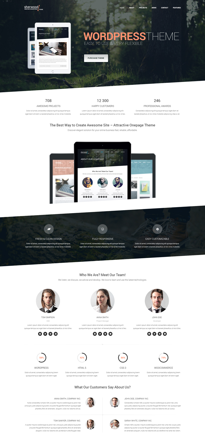
As the mobile web continues to develop, one page layout is the best choice to present a web project either on iPhone, tablet or any other device in the easiest way. One page layout allows to view the entire site without clicking on many links to visit many pages. Using scrolling, visitors can find all necessary information in a single page. Such navigation technique requires less page loading, flowing data, dynamic interaction and smooth user experience.
Parallax Scrolling
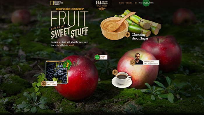
This trend often goes together with the previous one. With the help of parallax scrolling, one page layout becomes more engaging and attractive for the users. The main concept of parallax scrolling is creating great visual effect when the background of a website slowly moves to its foreground. If you need to tell a story with visual support, guide visitors through the site or provoke their curiosity – parallax scrolling will be great design solution.
Material Design
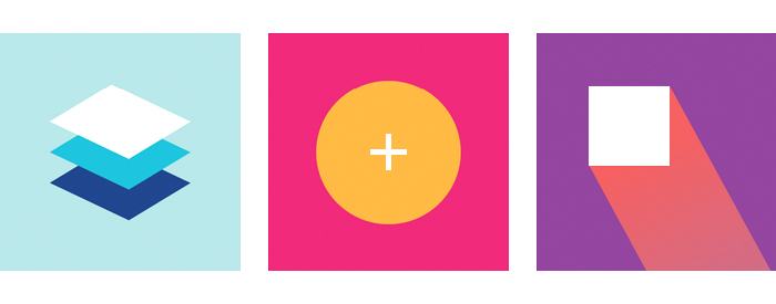
This new Google trend provides bold graphic interface along with the realistic look of the each element of design. Intuitive UI, easy navigation, bright colors, edge-to-edge imagery and large-scale typography are the main principles in material design. It also includes animations, transitions and other effects which are responsive and consistent across apps. Being extended from the flat design, material design supports better mobile browsing by enhancing the visual and motion experience.
Background Images and Videos
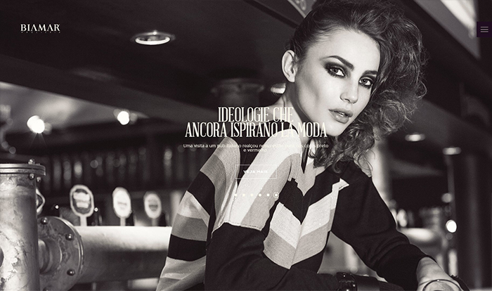
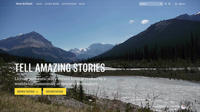
Visual aspect comes out on top in preference to large image and video backgrounds rather than to sliders and a big amount of text. This trend became really popular in this year and more likely will be dominating in 2015. It is a great way to catch attention and present your project to the audience. People prefer watching over reading, so use big images to express your ideas online and stay in trend.
Microinteractions
This trend is being in place recently and represents the engagement technique which is implemented to bring a call-to-action strategy to the forefront. Microinteractions are mostly used in email signup forms which appear in the most visible place of a website. Microinteractions are good for viewing or creating a small piece of content like a status message, interacting with a single piece of data and connecting devices together. More likely this trend will reach its peak in 2015.
Responsive Layout
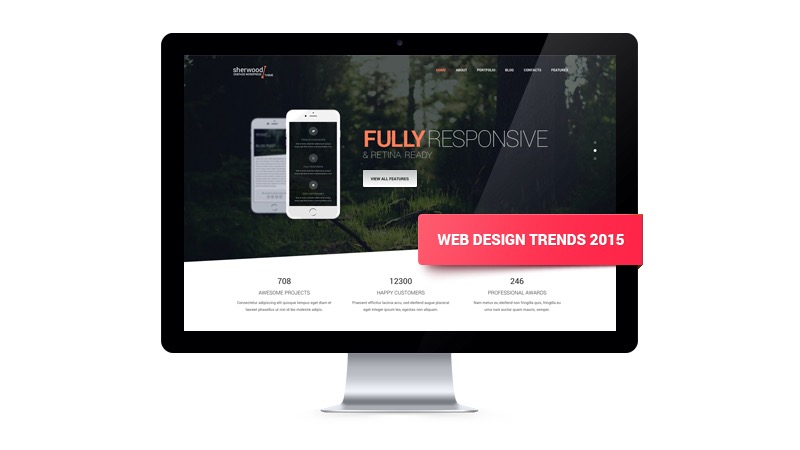
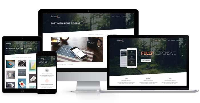
Nowadays this trend is firmly entrenched in the web world and will stay not only in the next year, but long afar. The number of people using mobile devices is constantly increasing, so each website owner aims to bring flexible design which can be adjustable for any screen resolution. With the appearance of new devices, responsive technologies will be developed and advanced, so flexible layout is a must-have point for every professional website.
Typography
Impressive typography was already a trend in 2014 and it’s going to take the stage in the next year. Typography holds the key to good web design as with the help of appropriate typeface and its original style you can convey the atmosphere of a story and personalize your website as well.
In Conclusion
According to the growing popularity of presented here trends, there’s no doubt that they will be around in 2015, though some new ones may also appear. We hope that this blog entry will help you stay well-versed and build new creative up-to-date projects next year. You may notice the mainstream tendency towards simplicity, smooth user experience and mobile optimization which have been guiding the way. So keep a lookout for these trends and transfer them into your new projects.
