Convey Emotions and Increase Conversions: Practical Guide
Thinking in a rational manner is not the only way of making decisions. Emotions often impact on how we act, solve certain problems and complete various tasks in our life. Positive emotions are commonly used for marketing needs to engage more customers, accelerate sales and maximize loyalty. Connecting on emotional level should be taken into account not only to grab attention of your target customers but also convince them to “stay with you” for as long as possible.
When it comes to website promotion, emotional connection is often left by the wayside, and it’s wrong. Today it is quite important to appeal to something that your potential customers consider to be valuable and reliable. Long-term relations between a company and a customer are determined by emotions.
Many website owners focus their efforts on content and that is great, but design elements affect the way of how conversions happen. We will provide the insight on the connection between emotions and a number of unique visitors who take an intended action on a website. We will also try to help you understand how to instill positive emotions to your visitors.
What is a Conversion?

A conversion is defined as a number of website visitors performing certain actions in relation to a number of actual visitors.The type of conversion is determined by two major aspects:
1. What do you want a user to do?
2. What options are actually available for a user?
The impliable actions may suppose:
● reading or scrolling;
● sharing a link;
● making a purchase;
● filling up a contact form;
etc.
Your aims should match the list of options available on your website.
Positive Emotions and Customer Engaging
Conversions show that users are engaged and this is the main purpose of creating any website. Every brand has its own conception and purpose, and every website’s design should cause the related emotions.The web design should provide an emotional connection to every action made on the page.
Each of us is aware of something that brings us inspiration. Modern psychologists state that positive emotions give a broader spectrum of possible actions than negative ones. If you are open to your customers, it is sure to bring them to discovery and widening the range of thoughts. Positive experience leads to positive associations. As a result, you get more chances to make them become interested in learning who you are and what your brand is.

When you “speak” with a customer through your website, try to state that “we” is more important than “me”. Show people you do your business right for their comfort, their ambitions and their desires and not only for your own profit. Use “Check it Out!” instead of impassive “Checkout!”, say “Join Us Now” instead of “Create an Account”, and prefer something like “Learn More” , “See How it Works”, etc., when calling a user to action. Customer satisfaction is a priority and this should be reflected in design. You can deliver the right emotions through:
● color;
● images;
● tone of language;
● emotional ties.
If a tone of language mostly refers to content, then choosing a right color and imagery is the good way for designer to express the required emotions and get the desired actions. If you know the goal of your website and you’ve learned the main expectations of your potential users, now it is time to answer several most essential questions:
1. What do I need to determine what emotions are right for my target customer?
2. What feelings should be used to connect a customer with me?
3. Is the goal of my website linked to my brand?
4. What do my users expect from me?
The answers are always individual and they differ depending on the field of your working and final objectives you pursue. The significant thing to say is that all your CTA buttons, advertising blocks, separate menu sections, headlines and photos should evoke:
● attention and surprise (suggest help);
● trust and belief (make sure you are the one to trust);
● expectation and anticipation (cause interest before launching a certain project);
● joy and pleasure (offer benefits and bonuses for performing actions);
● happiness and energy (collaboration with you will bring prospects);
● exclusivity and uniqueness (a customer should know you fulfill their fondest dreams and meet their major needs).
The key fact to remember is that emotions are personal, and different people react to various emotions differently. After you do everything to cause all the emotions mentioned above, check how they affect your connection with a user and update your design on a regular basis according to ever-evolving user expectations.
What is Emotional Web Design, Anyway?

Any good design that speaks to people’s emotions is described according to the definite aspects:
1. It is clear and understandable.
2. It takes visually appealing things to provide an emotional connection.
3. It holds users’ attention to keep them interacting with the site.
4. It stays in users’ memory.
Sometimes website owners prefer using negative emotions to create conversions. Feelings like sympathy or anger sometimes work as demotivation allowing users understand what is wrong and making them stay on the page to perform an action. However, if your aim to bring the right message and create good impression, you’d better use a positive emotional tie. Nevertheless, if you wish to apply negative emotions for better conversions, first test this idea and find out what feedback to expect from your users.
Web Design Principles that Convey Emotions

So what are the specific design tactics that create emotional connections between a user and a website design? Let us name the most common ones:
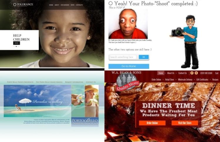
1. Keep it Organized. Clean and easy-to-use design is the first step to get someone engaged. If the design is easy to interact with, it causes only positive emotions and impressions.
2. Make it Minimal. Minimal design is not only a modern tendency but a real possibility to build a focus and a concentrated call to action.
3. Stick to Material. This design type is used for popular apps and websites on various devices. Its simple structure and impressive effects keep users clicking.
4. Exploit Buttons. Flat design brought us attractive bright and bold clickable buttons which cause positive emotions and guide visitors to perform an action.
5. Embed Videos. Videos are the best way to create a visual connection with a user and cause required emotions.
6. Use Scrolling. Long-scrolling websites engage customers better. When a user scrolls a page it is sure to increase on-site times and result in much better conversions.
Just make the pictures look as realistic as possible and make interactions work as if a part of a physical reality. When you think of a tone of language, select phrases which people usually use in life. All of this is much important to associate your web design with real life and make people feel right emotions to become your loyal visitors and customers.
